|
|
|
|
|
|
|

Profitable Conversationalist
|
 Posted: Thu Jun 26, 2008 7:27 pm Posted: Thu Jun 26, 2008 7:27 pm
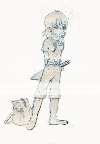
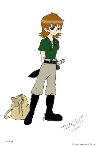
Hi, this is my latest WIP. I particularly need a little help on anatomy and her clothing...but any and all critiques, red lines, and comments are welcome. Yes, I know one eye is a little weird, I'll fix that later. I'll post edits in this space as I fix things. Original Sketch: Larger version, not digitally enhanced Larger version, not digitally enhancedEDIT: I know it isn't cleaned up. I used a non photo blue then redid the lines in a 2H pencil before scanning. Then I fixed the contrast so you could see the pencil as it was really light. Go figure, now you can see some of the blue! xd Final Art: 
|
 |
 |
|
|
|
|
|
|
|
|
|
|
|
|
 Posted: Thu Jun 26, 2008 8:30 pm Posted: Thu Jun 26, 2008 8:30 pm
Just for the record, the weather today is slightly sarcastic with a good chance of...
Hm, all I can say is that her foot, the one on the viewer's right, looks like it dips inward a bit too far on the top, if you know what I'm saying. And the cheek on the viewer's right looks a little bit flat, you might want to make it go out farther. But I love the way you did the shirt, the collar is very realistic. Nice job!
... A. Indifference or B. Disinterest in what the critics say. ~Panic At The Disco
|
 |
 |
|
|
|
|
|
|
|
|
|
|
|
|
|

Profitable Conversationalist
|
 Posted: Thu Jun 26, 2008 8:44 pm Posted: Thu Jun 26, 2008 8:44 pm
Good call on the boot. I fixed it, and added a little more flesh to the cheek. I scan the updated version on Friday. You're right, the face looks better now.
|
 |
 |
|
|
|
|
|
|
|
|
|
|
|
|
 Posted: Fri Jun 27, 2008 2:09 am Posted: Fri Jun 27, 2008 2:09 am
Hello. I like your picture. She's very cute. 4laugh Ummm... I know you already mentioned the face thing and that you fixed it, but since I don't know what it looks like now I'm gonna mention a tip for future reference. The jawline goes up the the ear on the visible side right? So the other jawline should align with that one (taking into account the angle of the head). Perhaps more creases in the pants so they don't look so... fake? confused I'm not very good with clothes creases so others may be able to help. Also, for the sword. I think, if it's sitting in a hilt thing and is on the belt, then the belt-connection thingie should be more recognizable. And if she's just holding the swords like that, well I think it'd fall because it would hit her butt (which is probably somewhat round). Which reminds me! Maybe a little more curvy-ness on her hips (make them rounder essentially since she's a woman) would help make her look a little more like a girl (even though the boobs are a pretty good indication, I know). Oh. The nose is also at a kinda weird angle and it's a little too straight (if you just make it slope a little, which I can assure you really does happen in manga with totally pointy-nosed people). One last thing, the boots are a little too smooth ; boots tend to have hard soles (flat) and a little more straight edges so hardening them would make it look a little less fluid-y). Although, the transition from the back of the boot by the ankle to the foot seems a little too dramatic.
She's cool. I really like how to you did the bag, and the sword. I can't draw swords well. Her outfit is also nice and relaxed, and fitting. It really seems like it goes with her.
|
 |
 |
|
|
|
|
|
|
|
|
|
|
|
|
|

Profitable Conversationalist
|
 Posted: Fri Jun 27, 2008 5:49 pm Posted: Fri Jun 27, 2008 5:49 pm
I posted my edits in the 1st post. I did something awful to that hip... redface I can quite get it to look natural. I think I still need to teak her nose too.
I added a bit of the holder for her sword, not that it is very visible. And I fixed her ear...she was starting to look a little elven there.
|
 |
 |
|
|
|
|
|
|
|
|
|
|
|
|
 Posted: Sat Jun 28, 2008 3:08 pm Posted: Sat Jun 28, 2008 3:08 pm
Well, since she's turned kinda you don't need to fully bring out that right hip. Just doing it slightly would work, or you can take it almost all the way back in on that one. You're right about the nose, I think it needs to come down (like the angle, not the actual nose) a little more, but it's still really good! 3nodding
|
 |
 |
|
|
|
|
|
|
|
|
|
|
|
|
|
|
|
 Posted: Sat Jun 28, 2008 10:46 pm Posted: Sat Jun 28, 2008 10:46 pm
 Truth is beautiful... Truth is beautiful...It's adorable whee
I want to steal your feet-drawing skills!!!
I agree with most of the comments.
Only other thing that pops out to me is her...'underarm' I guess would be the right term. Arm pit XP
Where her arm separates from her body, since it is going behind her back, that curve you have going inward should probably keep going in the original direction. More towards the shoulder, y'know??
I really like this.
The pose, the clothes, the design.
It's all so...nifty  ...but so are lies. 
|
 |
 |
|
|
|
|
|
|
|
|
|
|
|
|
 Posted: Sat Jun 28, 2008 11:26 pm Posted: Sat Jun 28, 2008 11:26 pm
Ooh...good catch! I shall fix that.
|
 |
 |
|
|
|

Profitable Conversationalist
|
|
|
|
|
|
|
|
|
|

Profitable Conversationalist
|
 Posted: Mon Jul 07, 2008 7:02 pm Posted: Mon Jul 07, 2008 7:02 pm
Final version is up. Any advice for next time?
Yes, I already know I am no good at coloring. redface
|
 |
 |
|
|
|
|
|
|
|
|
|
|
|
|
 Posted: Tue Jul 08, 2008 12:08 am Posted: Tue Jul 08, 2008 12:08 am
On actually drawing it? Nope. I think everything's been said. Maybe more shading when you are coloring. mrgreen And I already read that you have trouble coloring so I understand why you didn't shade. What did you use to color it by the way?
It looks great by the way. Shading may have enhanced it or whatever, but it turned out great nonetheless. So, congratulations on completing this piece of art! blaugh
|
 |
 |
|
|
|
|
|
|
|
|
|
|
|
|
|

Profitable Conversationalist
|
 Posted: Tue Jul 08, 2008 6:11 pm Posted: Tue Jul 08, 2008 6:11 pm
Thanks! I'm really happy with how this came out.
I use Photoshop to color. I'm still trying to learn shading techniques. I did attempt some shading, but it wasn't pronounced enough to be noticeable when resized. I'll keep working on the shading.
|
 |
 |
|
|
|
|
|
|
|
|
 |
|
|
|
|
|
|


 Truth is beautiful...