Because I recently did so much of it and don't want to flood arta.
Yeah, also I can collect it in here which is cool.
WITH A NEW TITLE OH YEAH.
Also I did some stuff on my tegaki e. My username there's "no surprises".
----
Most recent one would be
The ******** Scarecrow. YEAH.
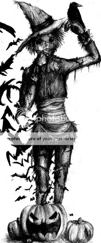
This was a birthday-present for a good friend. Well Scarecrow's his favorite villain and we're generally both all nerdy when it comes to Batman and crap so.
Yeah it's the Scarecrow fear him big time man.
INCLUDING FAILBATS AND A BATKIN
Well however
the hat's SUPERAWKWARD and some stuff about this fails
BUT EVERYTHING COOL IS DEDICATED TO SAID FRIEND, NEON.
And I'm actually sort of glad with the outcome so.
Fullview on Deviantart I'd say.
Two-Face. Once again.
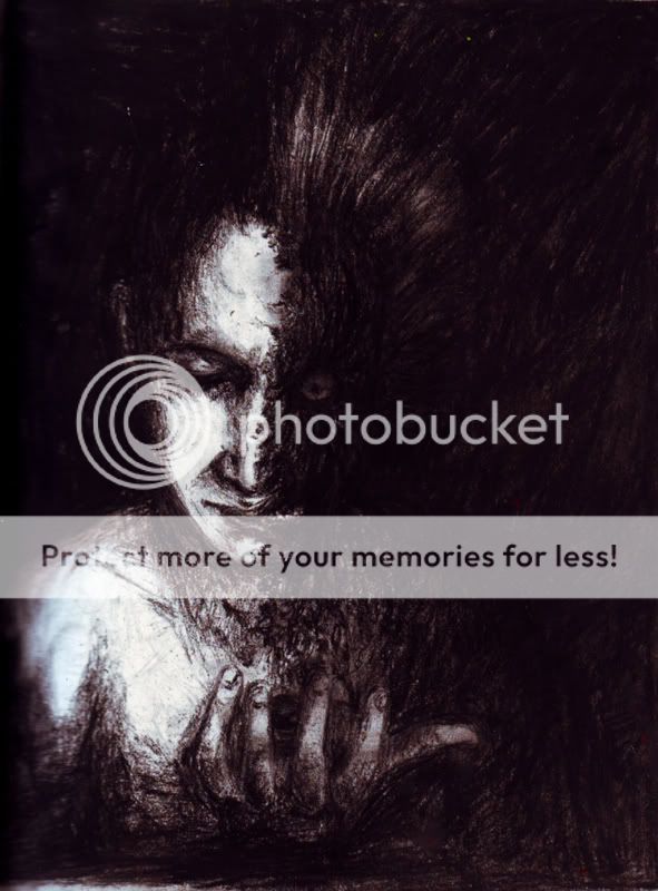
DID I MENTION HE'S MY MOST FAVORITE VILLAIN EVER.
Did this with charcoal. At "home" and at yana's.
Man, parts about this fail, and I am TOTALLY glad with other parts. I can't tell. But as for now, I'm sort of glad with the overall outcome. Which is good I suppose.
Two-Face. Imprisoned in the Arkham Asylum.
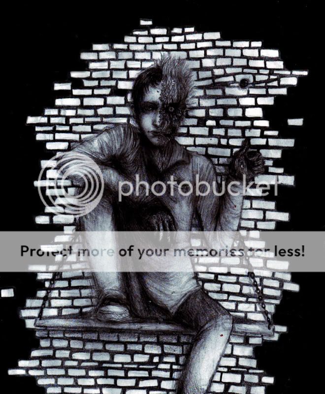
I had an idea for a pose like this. It turned out all fail 'cause the backrgound doesn't seem like it's working at all. ALSO this looks a hell lot better on paper which is really pissing me off 'cause I like how it looks on paper sort of actually. Oh man. School and at "home". Guessed so huh.
Two-face. Oh my.
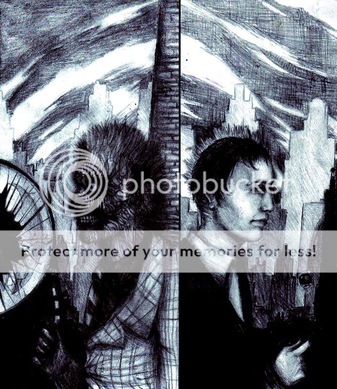
Two sides of the same story.
Same place, same moment- Just from another view.
More or less, another side.
I liked the concept.
However, I'm relatively glad with it on paper.
It does fail a lot scanned, though, 'cause details, shading and grayscales got eaten. Look at that hardcore failing sky! I mean, it looked so different on paper. You call it GRAY. ******** it man.
The Mad Hatter. Also known as Jervis Tetch, a neurologist.
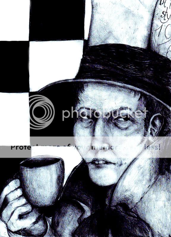
Yeah. It's weird how his design in a lot of comics and the series differs. Esp. size-wise. And I totally have no clue how to show him since well so much stuff about him is totally different per comic, even his way of talking and general behavior. HOWEVER he has those supercool mind-control-cards and stuff and yeah. Wow stuff about this drawing fails but whatever really.
The Scarecrow. Also known as Dr. Jonathan Crane.
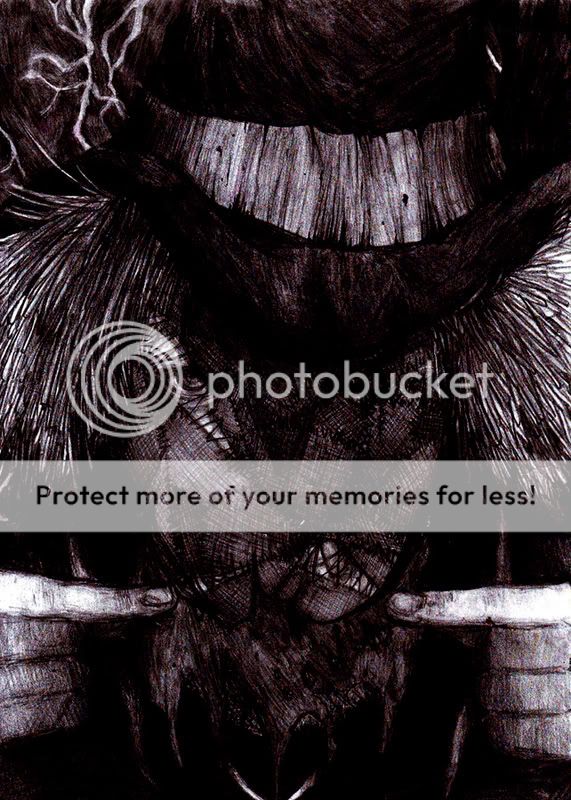
It's almost impossible to make him look scary.
Really.
This was drawn for a friend of mine. Well obviously Crane's his favorite villain. And I mean I can understand it, with all this fear-business and him being an obsessed psychologist and stuff. And generally I'm, though pose and whatnot fail a bit, okay with the outcome. I mean, it's THE SCARECROW, a shadow who strives Gotham's night leaving the city in the clasp of fright.
Two-Face . Also known as former D.A. Harvey Dent.
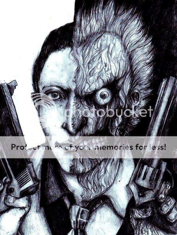
OH ALSO he has SUCH COOL QUOTES.
"I am a lawyer. Yes. We the people of the United States, in order to form a more perfect Union, establish justice. Insure domestic tranquility, provide for the common defense, promote the general welfare, and secure of the blessings of liberty to ourselves and our posterity. God bless America."
"I am a liar. No. We the acid scarred bitches of history of evil and hypocrisy exalt criminals to office. Vietnam, El Salvador, Chile with lovely missiles, roaring bombs of the rich and the white and the pious and burn children and torture women. Forever and ever, amen. God bless America."
- Arkham Asylum: A Serious House on Serious Earth
However, I failed hard at some parts regarding pose and whatnot. I'm not sure if I'm glad with the outcome. I'm glad with what I have on paper, sort of, but scanning killed details- especially on the bloodshed eye. Bweh.
And well, we also have Harley Quinn. Also known as Dr. Harleen Quinzel.
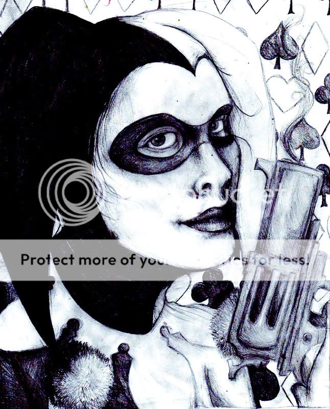
I'm not sure if that's the right version but whatever.
Dear lsg my neck hurts but that's 'cause of Harvey not Harley.
WELL.
The chin-area fails, so does the mouth and her shape of head and the issues with her clothes, but ********, I'm so damned pleased anyway right now. I'm sort of proud of the outcome of this one. I mean, I properly drew Harley, finally. She's annoying, loud, and just amazing. Also far up on top of my favorite villains but now everybody loves her right. Uh. I'm starting to get tired otherwise I'd start with how it'sher fault I got into Batman blahblahblah. Seriously, Harley Quinn, man.
Mr. Freeze. Also known as Dr. Victor Fries.
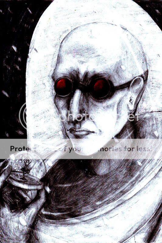
For all of you that are not familiar with Mr. Ice-cold ice-cream-machine, go watch heart of ice and deep freeze (I guess that was the name). Both made me cry. Several times. ********, why does that guy have such an enormously sad story?
So well it just didn't feel complete without the snowglobe with the figurine of his wife, Nora, in it.
'cause "This is how I'll always remember you-
surrounded by winter,
forever young, forever beautiful.
Rest well my love, the monster who took you from me will soon learn that revenge is a dish, best served cold.".
Drawing was a pain 'cause the outcome sort of fails. Also, the series I started requires the picture to have a background and I had a hard time deciding on this one. His nose and mouth killed me aswell. I left the eyebrows non-existant 'cause a friend thought it was a good idea and so did I. I really like how the pc made it look after all, though proportions and whatnot fail actually, but ******** it, I'm sort of proud.
Then, of course, Poison Ivy, also known as Pamela Isley.
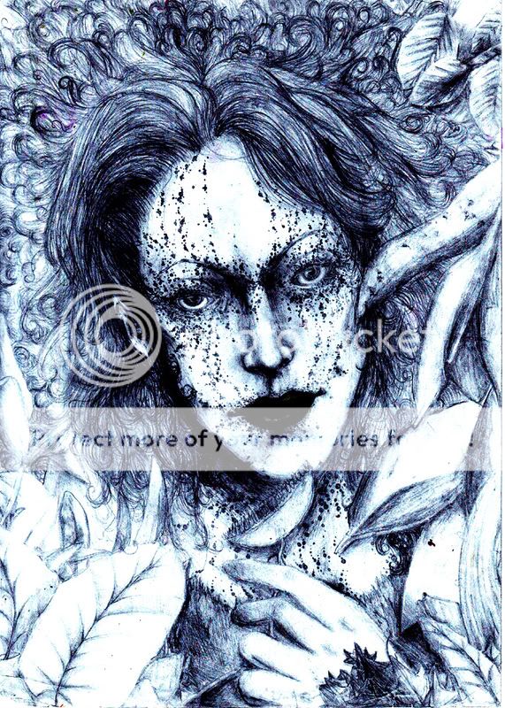
The dyke-ish feminist nature-maniac out there. Who won't go straight/lesbian for her? Also, a lady who lives on a toxic waste dump really deserves our love. And what a smart one she is also!
Regarding her I can pretty much point towards various episodes in BTAS, including House and Garden. Also, the way she looked in the long Halloween makes you all "EEHPRETTYSHEIS".
Well. This one was drawn at school for probably even bigger parts than the Joker- and the Mr. Freeze one. I can't tell 'cause all of them took a lot of time at school, actually. Uh. I'm pretty glad with how her eyes came out afterall. And all of those senseless little dots that actually have sense though I can't tell what exactly they are. Uh. Some stuff about the shadowing fails and you see the version that lacks some shading there. On paper, it has a variety of grayscales, but I liked the way photoshop made it look here. I can't tell which will be the final version, though. I'm also sort of proud of this one, though the shading-, contrast-, pose- and whatnot issues fail.
Weird thing, there's also the Joker, uh, Jack.
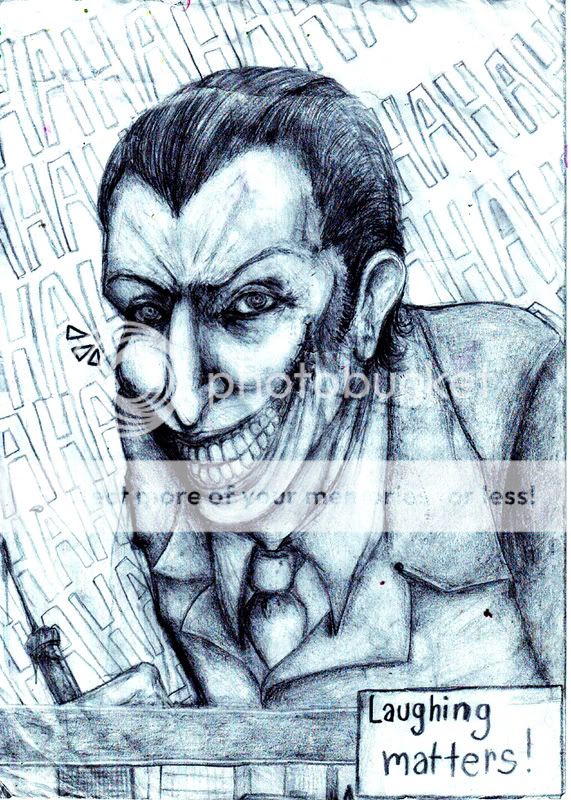
The first piece of Joker-fanart I'm glad with, really. I actually wanted to draw him in a sort of serious way (lulz), not just a sketch somewhere in a pad next to my homework. Also, in a pretty much comic-based way 'cause all the movie-Jokers were getting on my nerves. If you like the movie and esp. the Joker so much, go and get that it's comic based and read some of the comics so you know Nolan hasn't invented the hero nor the villain in the story he told blah blah.
I gave "Batman | Joker" to a friend which is ******** up 'cause I love the Joker in it and she lives some hours from here. Duuh.
WELL. I'm also sort of proud of this one. It's generally messy and fails, my handwriting isn't fitting and what is written fails also, but ********.
-----------------------
Two-face. Damn it it sucks as for the lame background and the right ride of his face. Oh my the paper's too thin. Erasing parts killed the eye so it looks 100% closed though it isn't. Also, I'm not too glad with how that part of the face looks anyway. The other, on the other hand, came out better than I expected it to. Oh my.
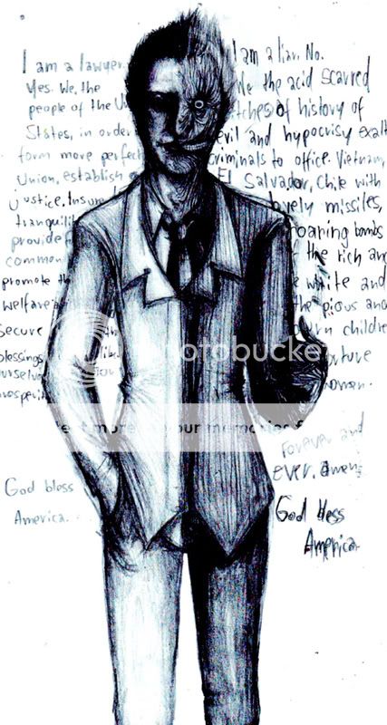
Though I really like how it looks when you drag the halfes away from each other sort of.


Hmm. Also another version. They all don't show too much detail for the high contrast, but it works best with it I suppose. The nose par example is actually quite.. different on paper, though.
Also, recently done at school- Edward Nygma, our dearest Riddler.
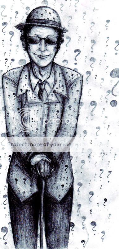
His face is awkward. So is his hand.
Wow a lot of questionsmarks. Well, regarding it was at school and I really didn't have much reference but the people around me I don't hate it to put it this way. I'm unsure about it yet I see a lot of fail. Partly potential fail, but still fail.
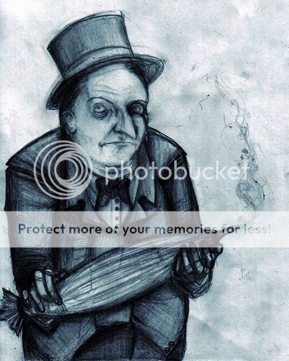
And Oswald Cobblepot, the Penguin.
Already posted this one once.
Including commentaries.
Regarding I don't draw people of his shape a lot (never before actually) I do like it sort of.
Poison Ivy drawn on yana's tablet.
A painting of two-face.
Harley Quinn.
Man I must seem obsessed now.
Yeah, also I can collect it in here which is cool.
WITH A NEW TITLE OH YEAH.
Also I did some stuff on my tegaki e. My username there's "no surprises".
----
Most recent one would be
The ******** Scarecrow. YEAH.

This was a birthday-present for a good friend. Well Scarecrow's his favorite villain and we're generally both all nerdy when it comes to Batman and crap so.
Yeah it's the Scarecrow fear him big time man.
INCLUDING FAILBATS AND A BATKIN
Well however
the hat's SUPERAWKWARD and some stuff about this fails
BUT EVERYTHING COOL IS DEDICATED TO SAID FRIEND, NEON.
And I'm actually sort of glad with the outcome so.
Fullview on Deviantart I'd say.
Two-Face. Once again.

DID I MENTION HE'S MY MOST FAVORITE VILLAIN EVER.
Did this with charcoal. At "home" and at yana's.
Man, parts about this fail, and I am TOTALLY glad with other parts. I can't tell. But as for now, I'm sort of glad with the overall outcome. Which is good I suppose.
Two-Face. Imprisoned in the Arkham Asylum.

I had an idea for a pose like this. It turned out all fail 'cause the backrgound doesn't seem like it's working at all. ALSO this looks a hell lot better on paper which is really pissing me off 'cause I like how it looks on paper sort of actually. Oh man. School and at "home". Guessed so huh.
Two-face. Oh my.

Two sides of the same story.
Same place, same moment- Just from another view.
More or less, another side.
I liked the concept.
However, I'm relatively glad with it on paper.
It does fail a lot scanned, though, 'cause details, shading and grayscales got eaten. Look at that hardcore failing sky! I mean, it looked so different on paper. You call it GRAY. ******** it man.
The Mad Hatter. Also known as Jervis Tetch, a neurologist.

Yeah. It's weird how his design in a lot of comics and the series differs. Esp. size-wise. And I totally have no clue how to show him since well so much stuff about him is totally different per comic, even his way of talking and general behavior. HOWEVER he has those supercool mind-control-cards and stuff and yeah. Wow stuff about this drawing fails but whatever really.
The Scarecrow. Also known as Dr. Jonathan Crane.

It's almost impossible to make him look scary.
Really.
This was drawn for a friend of mine. Well obviously Crane's his favorite villain. And I mean I can understand it, with all this fear-business and him being an obsessed psychologist and stuff. And generally I'm, though pose and whatnot fail a bit, okay with the outcome. I mean, it's THE SCARECROW, a shadow who strives Gotham's night leaving the city in the clasp of fright.
Two-Face . Also known as former D.A. Harvey Dent.

OH ALSO he has SUCH COOL QUOTES.
"I am a lawyer. Yes. We the people of the United States, in order to form a more perfect Union, establish justice. Insure domestic tranquility, provide for the common defense, promote the general welfare, and secure of the blessings of liberty to ourselves and our posterity. God bless America."
"I am a liar. No. We the acid scarred bitches of history of evil and hypocrisy exalt criminals to office. Vietnam, El Salvador, Chile with lovely missiles, roaring bombs of the rich and the white and the pious and burn children and torture women. Forever and ever, amen. God bless America."
- Arkham Asylum: A Serious House on Serious Earth
However, I failed hard at some parts regarding pose and whatnot. I'm not sure if I'm glad with the outcome. I'm glad with what I have on paper, sort of, but scanning killed details- especially on the bloodshed eye. Bweh.
And well, we also have Harley Quinn. Also known as Dr. Harleen Quinzel.

I'm not sure if that's the right version but whatever.
Dear lsg my neck hurts but that's 'cause of Harvey not Harley.
WELL.
The chin-area fails, so does the mouth and her shape of head and the issues with her clothes, but ********, I'm so damned pleased anyway right now. I'm sort of proud of the outcome of this one. I mean, I properly drew Harley, finally. She's annoying, loud, and just amazing. Also far up on top of my favorite villains but now everybody loves her right. Uh. I'm starting to get tired otherwise I'd start with how it'sher fault I got into Batman blahblahblah. Seriously, Harley Quinn, man.
Mr. Freeze. Also known as Dr. Victor Fries.

For all of you that are not familiar with Mr. Ice-cold ice-cream-machine, go watch heart of ice and deep freeze (I guess that was the name). Both made me cry. Several times. ********, why does that guy have such an enormously sad story?
So well it just didn't feel complete without the snowglobe with the figurine of his wife, Nora, in it.
'cause "This is how I'll always remember you-
surrounded by winter,
forever young, forever beautiful.
Rest well my love, the monster who took you from me will soon learn that revenge is a dish, best served cold.".
Drawing was a pain 'cause the outcome sort of fails. Also, the series I started requires the picture to have a background and I had a hard time deciding on this one. His nose and mouth killed me aswell. I left the eyebrows non-existant 'cause a friend thought it was a good idea and so did I. I really like how the pc made it look after all, though proportions and whatnot fail actually, but ******** it, I'm sort of proud.
Then, of course, Poison Ivy, also known as Pamela Isley.

The dyke-ish feminist nature-maniac out there. Who won't go straight/lesbian for her? Also, a lady who lives on a toxic waste dump really deserves our love. And what a smart one she is also!
Regarding her I can pretty much point towards various episodes in BTAS, including House and Garden. Also, the way she looked in the long Halloween makes you all "EEHPRETTYSHEIS".
Well. This one was drawn at school for probably even bigger parts than the Joker- and the Mr. Freeze one. I can't tell 'cause all of them took a lot of time at school, actually. Uh. I'm pretty glad with how her eyes came out afterall. And all of those senseless little dots that actually have sense though I can't tell what exactly they are. Uh. Some stuff about the shadowing fails and you see the version that lacks some shading there. On paper, it has a variety of grayscales, but I liked the way photoshop made it look here. I can't tell which will be the final version, though. I'm also sort of proud of this one, though the shading-, contrast-, pose- and whatnot issues fail.
Weird thing, there's also the Joker, uh, Jack.

The first piece of Joker-fanart I'm glad with, really. I actually wanted to draw him in a sort of serious way (lulz), not just a sketch somewhere in a pad next to my homework. Also, in a pretty much comic-based way 'cause all the movie-Jokers were getting on my nerves. If you like the movie and esp. the Joker so much, go and get that it's comic based and read some of the comics so you know Nolan hasn't invented the hero nor the villain in the story he told blah blah.
I gave "Batman | Joker" to a friend which is ******** up 'cause I love the Joker in it and she lives some hours from here. Duuh.
WELL. I'm also sort of proud of this one. It's generally messy and fails, my handwriting isn't fitting and what is written fails also, but ********.
-----------------------
Two-face. Damn it it sucks as for the lame background and the right ride of his face. Oh my the paper's too thin. Erasing parts killed the eye so it looks 100% closed though it isn't. Also, I'm not too glad with how that part of the face looks anyway. The other, on the other hand, came out better than I expected it to. Oh my.

Though I really like how it looks when you drag the halfes away from each other sort of.


Hmm. Also another version. They all don't show too much detail for the high contrast, but it works best with it I suppose. The nose par example is actually quite.. different on paper, though.
Also, recently done at school- Edward Nygma, our dearest Riddler.

His face is awkward. So is his hand.
Wow a lot of questionsmarks. Well, regarding it was at school and I really didn't have much reference but the people around me I don't hate it to put it this way. I'm unsure about it yet I see a lot of fail. Partly potential fail, but still fail.
And Oswald Cobblepot, the Penguin.
Already posted this one once.
Including commentaries.
Regarding I don't draw people of his shape a lot (never before actually) I do like it sort of.

Poison Ivy drawn on yana's tablet.
A painting of two-face.
Harley Quinn.
Man I must seem obsessed now.


