Welcome to Gaia! ::

The Official How to Draw Manga Guild

Back to Guilds


Tags: artist, manga, anime, draw, learn 

Reply Main Guild Forum
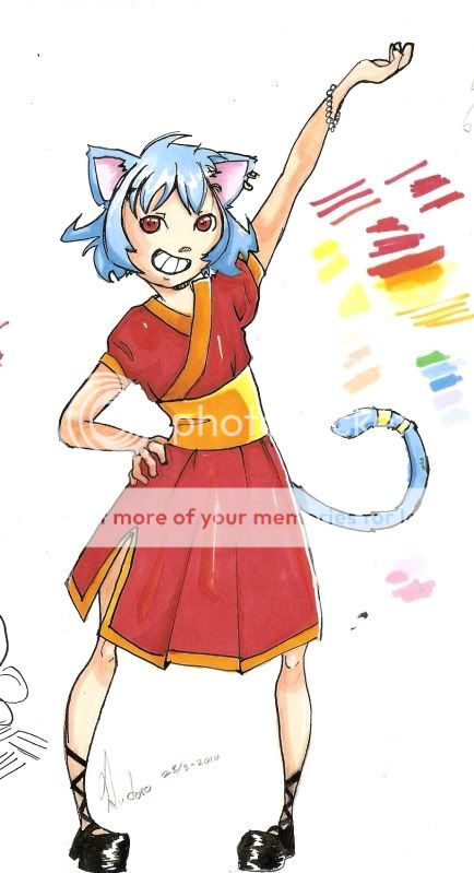
First time posting. New style. Please give critique!!

Quick Reply

Enter both words below, separated by a space:

Can't read the text? Click here

Submit

Soooo... What do you think?
  Nope, no good. Try again!
  It's all right, not bad but not good either
  It's actually pretty good, I like it!
  Awesome! I LOVE IT!!
View Results

Rutoro

PostPosted: Fri May 28, 2010 1:36 pm


User Image

Alright, I decided that the best way to learn by my mistakes is by having other people point them out for me and teach med some tips and tricks on how to fix them.

I recently finished this drawing, I know some of the faults with it like the colouring and her right leg, and it's a pretty new style I'm trying out and would like some constructive critique on it :3 I inked it using a quill(I think that's what they're called in english but I might be wrong! xD) and coloured it with Promakers, both which I'm very unfamiliar with so I used this drawing to practice.

PLEASE tell me what you think about it and be HONEST!! (Honest does not mean "flame me" though)

The colouring quality/intensity is heavely decreased by my scanner, just so you know! Dx

THANK YOU IN ADVANCE!!! biggrin
PostPosted: Fri May 28, 2010 2:08 pm


Blargs...i likes jor drawings :] and as you so stated, it is a new style, i dont see much of those. I dont know if you did it on purpose but the legs to me seem to be in the wrong angle and un-proportionate :O all in all ish good art biggrin

xKUR0GANEx

6,500 Points
  • Friendly 100
  • Profitable 100
  • Flatterer 200

gothic_girl_101

PostPosted: Sat May 29, 2010 11:13 am


I really like this <3
I haven't seen this artstyle in a while.
Great job on it. =) very original.
The legs to me are a part of the artstyle so you've done a great jon on this
Keep drawing stuff like this Its absolutely great
PostPosted: Wed Jun 02, 2010 2:20 am


Judging by the face's positioning, the bangs and ears don't seem to be where they should be... or the face is in the wrong place. It seems a little weird to me that the wrists/forearms look pretty normal while the ankle area is so slim... and that the elbows seem bigger than the knees...

At the part of her dress inbetween her legs, I think that folded part should be behind rather than in front. I've got nothing to support it, but it seems to me like it would look more natural being behind. The strap things on her shoes are different lengths. They also look like it's just one strap thing wrapped around the leg, possibly not even clamping together anywhere, which doesn't look very effective. I like all the colours aside from the red you have accompanying the white on the dress. Mixed feelings about the shading...

I'd maybe not have the legs in line like that... well, I probably would do that and then regret it later. Anyhow, her whole body sorta looks like it's turned towards her left (counterclockwise if we looked at her from a top view). If that's the case, it would be difficult to have her left leg (our right) where it is.

Last thing that's bothering me is the lack of eyebrows.

Zantetsken

Reply
Main Guild Forum

 
Manage Your Items
Other Stuff
Get GCash
Offers
Get Items
More Items
Where Everyone Hangs Out
Other Community Areas
Virtual Spaces
Fun Stuff
Gaia's Games
Mini-Games
Play with GCash
Play with Platinum