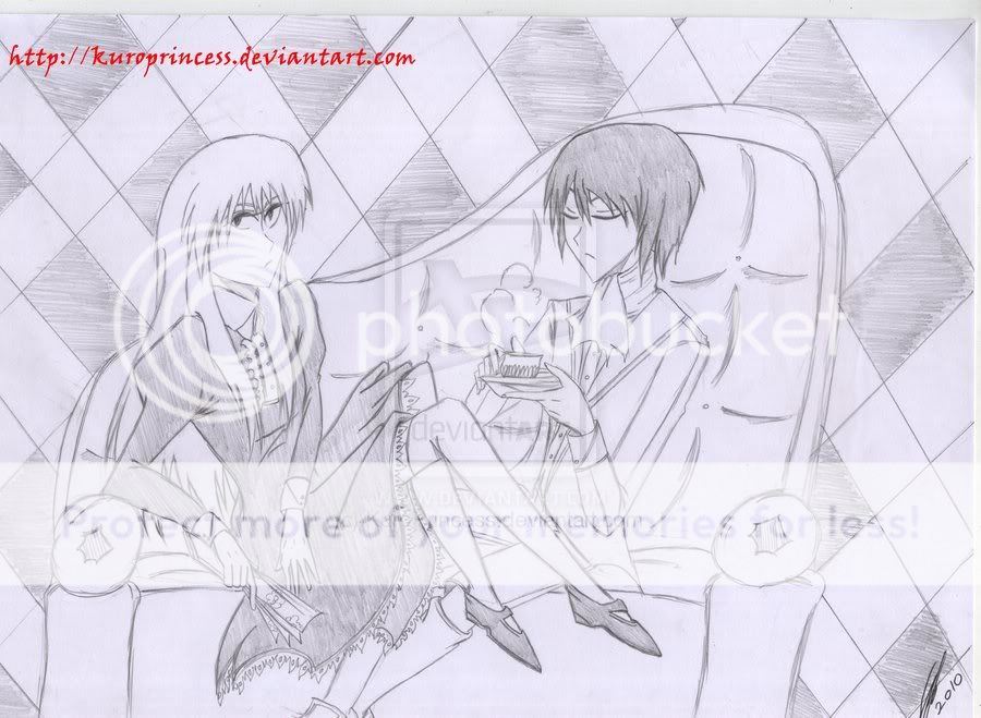
Basically, this: These are some of the characters from the series I'm working on. Comment & critique me, please? 3nodding3nodding
Posted: Wed Dec 22, 2010 4:27 pm
The folds in the dress look great but back of the girl's head seems too flat. The right side of the couch is on a funny angle and so is the man's tea cup . It looks like the girl's legs are floating in mid-air but overall its good picture and you really need to look awhile to find most of the mistakes.
Kezza_teh_Fezza
Offline
Blade of the Contessa
Unforgiving Duelist
Offline
Posted: Wed Dec 22, 2010 9:03 pm
Thanks for letting me know thatheartand yeah, I'm not that good at drawing inanimate objects. Still, I might be able to improve...
Posted: Fri Dec 24, 2010 8:35 pm
Alrighty I really like how you got this picture cause its just graceful. and looks like alice in wonderland.. or maybe something diffrent. and eligant.
but you really need to work on the most is propotions like, the eyes are alittle to close together. always make sure that they are atleast a circle the size of an eye apart.
and just how the posture is in general. thats the only thing i see that stands out the most. but thats it : )