Kupocake
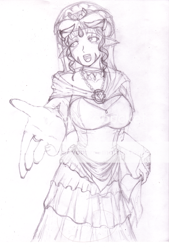
Lovely concept sketch for your OC's wedding dress, I love all the little details!
There is something quite off with the foreshortening of her hand. The first blaring error I have found was the way the ring is perceived. If the hand was completely removed, the ring looks like it is tilting downwards towards the viewer, when it should be tilting upwards because of finger-perspective in general. Unless it is a very special ring that curves in the way, it should be seen in a different angle. The pinky especially seems to be lacking almost an entire section of the finger (from the palm to the first bend on a finger). I would extend that finger a tiny bit so that the joint is more accessible to the viewer.
thats okay because its not a ring xD;; its her glove... thingy? should find a way to make that more clear... xD my mom thought the same thing when I showed it to her.
(besides that would be the wrong finger for the ring)
yea... the pinky does look funny... o.O I will look into fixing that maybe lol I didn't really notice it till you pointed that out O.o
@wicked ya know how hard that is to do o.o I think I will find a camera and or mirror for when I fix the hand xp;
great idea that aside however ^.^


