|
|
|
|
|
|
|
|
|
 Posted: Wed Nov 05, 2008 2:34 pm Posted: Wed Nov 05, 2008 2:34 pm
New characters...or not so new.
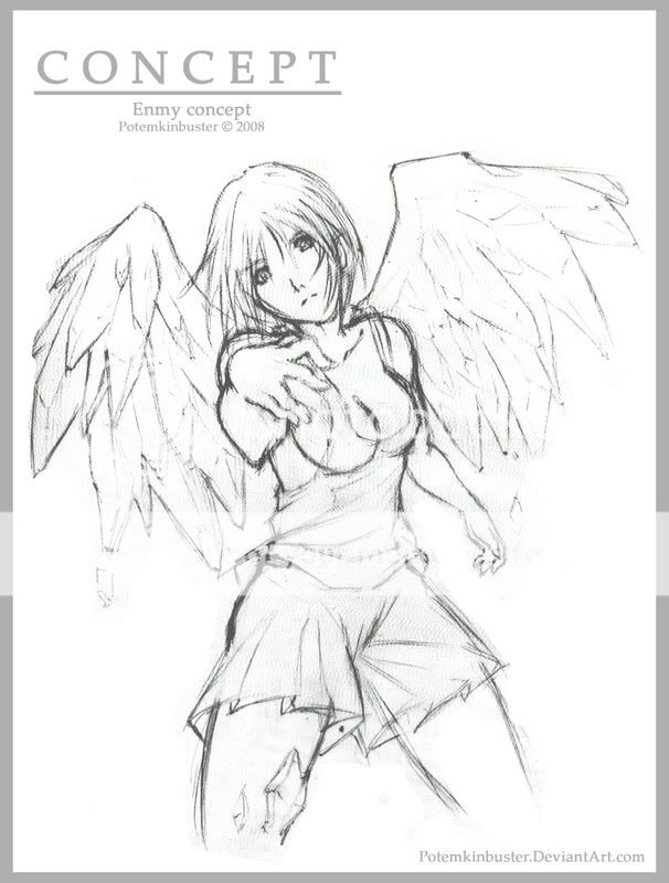
Once I posted a design of Enmy in here, but I've been changing a few things about her looks so....it's almost new ._.
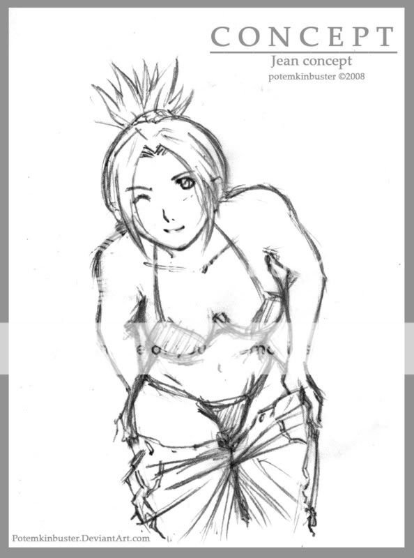
Anyway, here are two new designs.


Comment and critique, please?
|
 |
 |
|
|
|
|
|
|
|
|
|
|
|
|
 Posted: Sat Nov 08, 2008 11:01 am Posted: Sat Nov 08, 2008 11:01 am
they're very good, Potemkin
|
 |
 |
|
|
|
|
|
|
|
|
|
|
|
|
|
|
|
 Posted: Fri Nov 14, 2008 11:31 pm Posted: Fri Nov 14, 2008 11:31 pm
It's hard to find things in wrong from these pics, they are allmost perfect. eek
In the first pic the perspective is really greatly done (and I love the wings), but the fingers look bit weird. They would look more realistic if the umm tip finger part would allso face down, not up. Try with your hands that position so you'll maybe better get what I'm saying.
In the second pic, I can't find anything. The position you drew is really hard to draw and it's just perfect! Hey, make a tutorial how to draw that pose, it would be cool, maybe then I would finally learn how to draw it. xd
|
 |
 |
|
|
|
|
|
|
|
|
 |
|
|
|
|
|
|
