|
|
|
|
|
|
|
|
|
 Posted: Sat Nov 29, 2008 5:24 pm Posted: Sat Nov 29, 2008 5:24 pm
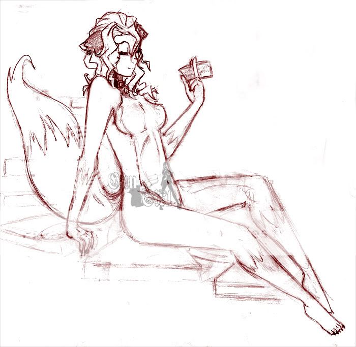
" Darling Nikki" [Old Sketch] gungirl.deviantart.com gungirl.deviantart.comThe fourms seem more dead then usual.. Or maybe you guys just don't feel like commenting on my work lol XD Yes, this was inspired by the song "Darling Nikki" by Prince. I was thinking about the song quite often and then on my way home today it plaied in the car. I use to draw anthro, but was very bad at it lol So I stopped for quite some time. I thought I would try a shot at it again. I enjoied it. Any Further Anatomy Critiques before I ink it? Thank you wink -GG
|
 |
 |
|
|
|
|
|
|
|
|
|
|
|
|
 Posted: Sat Nov 29, 2008 8:28 pm Posted: Sat Nov 29, 2008 8:28 pm
pretty good. I can't find anything. I say ink it
|
 |
 |
|
|
|
|
|
|
|
|
|
|
|
|
|
|
|
 Posted: Sat Nov 29, 2008 9:24 pm Posted: Sat Nov 29, 2008 9:24 pm
Well, first off I love it. I need to say that and get it you of the way right now. She looks very alluring like “come and get it, big boy” and it reads all in her expression, something most artist fail to capture. the few critiques I do have, aren’t even that big and most of them are easily fixed.
1) Her torso looks very static, kinda like she is leaning with her back against a wall. I think that if your either put a wall behind her or arched her back more, make it a more pin-up pose that would fix the awkward look she has going on right now.
2) Her breasts are to high and to round. When nude, like she is, gravity does effect the breasts, unless they are very small. Considering hers are a decent size I would give them more weight. Another thing I noticed about them is the way you have them sitting on her torso. See how you have a rounding back towards the arm pit, that makes it look like she is being viewed from a ¾ angle, not from the side. The only time breasts would have that shape from the side is if they where in a bra or if they where fake.
4) Considering she looks very thin, I think that her rib cage should be more visible, right now, it looks like she has no ribcage at all!
5) Her belly button, at least I think that’s what that little digit down by her leg is, should be way higher, the belly button falls in line with the waist.
6) The legs, while they look amazing as is, should, in my opinion, have a bit more meat on them. Right now, your have her legs looking very flat on bolt top and bottom. The female form is very soft so rounding them out slightly would help keep a feminine appetence.
7) Her tail looks strange flowing like that. If your going to keep the steps going up put her tail down so that it is resting along the step behind her. Right now, the tail is very distracting.
You say you drew anthros before this? If this is any inclinations of what your anthros look like… they must have been good as well. Also, I love the hands!
|
 |
 |
|
|
|
|
|
|
|
|
|
|
|
|
 Posted: Sun Nov 30, 2008 6:59 am Posted: Sun Nov 30, 2008 6:59 am
I really like the feeling on this one =D
The only thing I would suggest you (since the others were already pointed out) is to fix the hands a bit, or maybe extending the forearm a bit more, bending the position of the hand a bit more to make it look more natural.
But other than that, looks great, I really like how you drew her hair ninja
|
 |
 |
|
|
|
|
|
|
|
|
|
|
|
|
|
|
|
 Posted: Sat Dec 06, 2008 7:53 am Posted: Sat Dec 06, 2008 7:53 am
|
|
|
|
|
|
|
|
|
|
 Posted: Thu Dec 11, 2008 2:35 pm Posted: Thu Dec 11, 2008 2:35 pm
when it first started loading I was a little in love with it. The face and shoulder look great. I know someone's already pointed out the torso problem, and the hand so I won't go into it. I guess the biggest problem for me is the flow of the picture. Her face looks very calm, but her posture is very rigid. her elbow is clicked straight, her legs don't look like they're resting but being held perfectly just off the ground (more her left leg than her right I think). and her tail is stuck straight up. Its almost like looking at two different pictures. Now normally I'd suggest giving her face more severe features and [removed](since its easiest to change), but I just love it so much as it is.
|
 |
 |
|
|
|
|
|
|
|
|
|
|
|
|
|
|
|
 Posted: Thu Dec 11, 2008 7:14 pm Posted: Thu Dec 11, 2008 7:14 pm
i really like the way its done, i like the redline by rapture. Normaly i would draw it bit more idealized sweatdrop but its great. the only change i would make, take a bit more off on the shoulder blade area of the back. bring that line a bit closer in. also i think the tail should come from a slightly lower point on the back, it may just be the perspective, but it doesn't seem to come from the tailbone area.
|
 |
 |
|
|
|
|
|
|
|
|
 |
|
|
|
|
|
|


