|
|
|
|
|
|
|
|
|
 Posted: Sat Jan 10, 2009 10:02 pm Posted: Sat Jan 10, 2009 10:02 pm
|
|
|
|
|
|
|
|
|
|
 Posted: Sun Jan 11, 2009 3:18 am Posted: Sun Jan 11, 2009 3:18 am
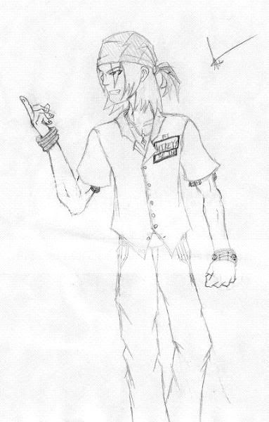
not bad at all. only thing i can say is that your hands seem to lack palms most of the time. id also play with some more dynamic poses and perspectives as well as playing with your line abit as you seem to be pretty good at those poses
biggrin
keep it up
|
 |
 |
|
|
|
|
|
|
|
|
|
|
|
|
|
|
|
 Posted: Sun Jan 11, 2009 11:31 am Posted: Sun Jan 11, 2009 11:31 am
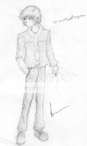
omg these r relli good. i give u major props on the pants...i hate drawing pants, wellat least like the croch area xd and thats y i make my shirts relli long lol. well so yea they pictures look good.
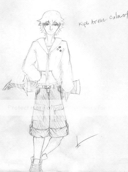
alll i have to say is that for the first drawing the way his leg is bending looks kinda awkward but other then that it looks good
other then that everything looks good
keep up the good workk mrgreen
|
 |
 |
|
|
|
|
|
|
|
|
|
|
|
|
 Posted: Sun Jan 11, 2009 7:13 pm Posted: Sun Jan 11, 2009 7:13 pm
looking really great!
only thing I can say is to keep practicing poses, and more specifically how the body fills out. The waist of that first picture seems a little off.
seriously though good stuff wink
|
 |
 |
|
|
|
|
|
|
|
|
|
|
|
|
|
|
|
 Posted: Mon Jan 12, 2009 7:59 am Posted: Mon Jan 12, 2009 7:59 am
theres also a slight problem with weight (if all these characters are standing still) for instance the top one looks like hes half way through taking a step, which is actually quite difficult to do biggrin
|
 |
 |
|
|
|
|
|
|
|
|
|
|
|
|
 Posted: Wed Jan 14, 2009 7:07 pm Posted: Wed Jan 14, 2009 7:07 pm
I quite often draw the pictures on a slant (the second one for example) and then when I scan them, since the paper needs to be completely vertical, it doesn't translate well.
|
 |
 |
|
|
|
|
|
|
|
|
|
|
|
|
|
|
|
 Posted: Tue Feb 17, 2009 12:40 am Posted: Tue Feb 17, 2009 12:40 am
Slanty poses. Very unnatural. =_=
The first guy's face looks strange and unnatural...nbut it's cool. And the last guy's legs don't fit in with the rest of his body, even if he is skinny. Otherwise, superb work.
|
 |
 |
|
|
|
|
|
|
|
|
 |
|
|
|
|
|
|


