|
|
|
|
|
|
|
|
|
 Posted: Tue Jan 27, 2009 6:21 pm Posted: Tue Jan 27, 2009 6:21 pm
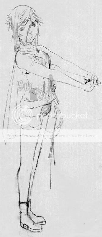
 gungirl.deviantart.com gungirl.deviantart.comAnother character I sketched up still in the sketch stage Anatomy and other problems please tell me much appreiciated.. cx
|
 |
 |
|
|
|
|
|
|
|
|
|
|
|
|
 Posted: Tue Jan 27, 2009 7:44 pm Posted: Tue Jan 27, 2009 7:44 pm
The design is good, and you have pretty solid skills.
What I noticed most was this: she's tipping over! Remember a character's center of gravity when making a pose.
Another problem is her head. It needs a bit more volume in the back. The eyes are placed good for the angle, but the eye on our right side needs to be foreshortened a bit to fit the curve of her head.
Oh and, you did a pretty good job on the hand pose I think. Can't spot anything wrong with it. biggrin
One last tiny detail, her knees should be moved up a bit so the two halves of her legs are more equal in length.
|
 |
 |
|
|
|
|
|
|
|
|
|
|
|
|
|
|
|
 Posted: Tue Jan 27, 2009 9:29 pm Posted: Tue Jan 27, 2009 9:29 pm
I agree with Twilight Spectrum
but I'd like to add that those hands=WIN wow
the only other thing is her legs and feet. Either your going for some perspective (whole other issue) or her legs and feet are much too small for the rest of her body
|
 |
 |
|
|
|
|
|
|
|
|
|
|
|
|
 Posted: Mon Feb 02, 2009 7:20 pm Posted: Mon Feb 02, 2009 7:20 pm
love the drawing. especially how there you can see the muscle thing and everything X]
well all i have to say is that the eyes look a bit far apart but thats it.
and for you ppl sayin that the feet look a bit small, i do agree but my friend is like an inch taller then me, shes about 5.7. and im about 5.6., and her foot is like a size 6 and mines a size 8 XD
so i guesss u can say somethings are physically possible
welll everything looks good to me other then that,
keep up the good work :]
|
 |
 |
|
|
|
|
|
|
|
|
|
|
|
|
|
|
|
 Posted: Fri Mar 06, 2009 12:46 am Posted: Fri Mar 06, 2009 12:46 am
Her head doesn't seem to have much depth. It's like the back of her head is missing. You should have more hair back there.
You've got a good idea of arm anatomy...but...how do I say this? You seem to have the arms back-to-front? Her right wrist is too skinny as well. Also, her body seems to be on a slant. It's quite impossible to stand like that without losing ballance. Otherwise, it's superly awesome. I love how you've got such a good sense of leg anatomy, and the torso is looking great. Keep it up.
Sorry if this has all been mentioned before and I"m just repeating others, I find that annoying myself...
|
 |
 |
|
|
|
|
|
|
|
|
 |
|
|
|
|
|
|

