Welcome to Gaia! ::

The Official How to Draw Manga Guild

Back to Guilds


Tags: artist, manga, anime, draw, learn 

Reply Main Guild Forum
WIP - Asian Girl - Realism - Harsh Critique

Quick Reply

Enter both words below, separated by a space:

Can't read the text? Click here

Submit

Do you like it so far?
  Yes
  No
View Results

[ okeyday ]
Crew

PostPosted: Fri Feb 13, 2009 10:04 pm


Bonjour!

So, started this today, but the face looks mighty fake.
._. I'm thinking it's the eyes? Not sure.
And then does it look like she's looking up?
Cause it sort of looks like she just has a fat jaw...
Bleh.


But any critique would be loved and appreciated!
Thanks ^_^
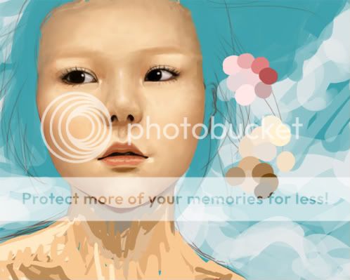

User Image
PostPosted: Sat Feb 14, 2009 11:35 am


Jesus Christ Okey, you got so much better from last time I saw you. Your choice of skin tones is much more vibrant and your shading became even more amazing. heart

The nose, I think, has the most problems. The ball of the nose isn't very pronounced, it blends together with the nostrils too well. Maybe also try to make the mouth-line stand out less? You could also try putting in some texture on the skin, like skin pores and whatnot.

There's not so much to say from me, because photo-realism is far from my specialty. It's beautiful so far, however. ^^

Kupocake
Vice Captain

Dangerous Capitalist

7,650 Points
  • Popular Thread 100
  • Entrepreneur 150
  • Profitable 100

[ okeyday ]
Crew

PostPosted: Sat Feb 14, 2009 2:47 pm


@ Kupocake:
First off, your siggy made me LOL so hard xD Ahahaa. Made my day! And oh I see what you mean. I'll fix that tonight when I go back to the drawing xD And thanks! ._. And I don't feel like I've gotten better @_@ I haven't drawn anything for fun that was outside of art class (with a demon for a teacher! Gah she's evil.)
PostPosted: Sat Feb 14, 2009 8:46 pm


Salut!

I think it's great! :3 But maybe blend the colours on the forehead a bit more? I think the shadow is too prominent. And maybe add...eyebrows? o.o
XD

Candy Cane Bunny


[ okeyday ]
Crew

PostPosted: Sun Feb 15, 2009 7:11 am


Candy Cane Bunny
Salut!

I think it's great! :3 But maybe blend the colours on the forehead a bit more? I think the shadow is too prominent. And maybe add...eyebrows? o.o
XD


It's not finished, so of course I'd add eyebrows ._. and the forehead isn't done either, and most of it will be covered by the bangs, so xD
PostPosted: Tue Feb 17, 2009 12:36 am


Well, it's a wip, so whatever. But the weird eyebrows (or lack of) makes her look like a plaster bust. And...the nose shape is a bit strange? Asians do have small or flat noses most of the time but still...it looks a bit off. It's real awesome though.

shiny dollar


BlackRose11111

PostPosted: Tue Feb 17, 2009 2:50 am


Wow this is good.
If I were my art teacher i would say the shading around the nose... and the shading that sets up the bone structure on the cheekbones, so probably under the eyes.

Although I think once you add the hair and details it will look just wonderful smile
PostPosted: Sun Feb 22, 2009 7:21 pm


I'm supposing your using Photoshop for this, and as such, I would suggest as towards the pores, a noise layer and use of a displacement map would probably be the best. (making a gray scale image from the shading on this image would mostly work right probably. You'd have to mess a little with it to be perfect though.)

Just a suggestion of course. Seems like a displacement map with a noise filter and a few layer styles would work wonders.... but I've only used displacement maps for a few very small things..... O-o... I think I'm rambling....

Anyway, as stated the nose looks wrong (probably the ball like suggested earlier.) and I think that they eyes are fine. They look to be looking off to our left, her right, and not up nor down. Should be a good piece when your done, and looks great so far.

Caliber Mengsk

Reply
Main Guild Forum

 
Manage Your Items
Other Stuff
Get GCash
Offers
Get Items
More Items
Where Everyone Hangs Out
Other Community Areas
Virtual Spaces
Fun Stuff
Gaia's Games
Mini-Games
Play with GCash
Play with Platinum