|
|
|
|
|
|
|
|
|
 Posted: Sun Mar 15, 2009 7:16 pm Posted: Sun Mar 15, 2009 7:16 pm
 http://calibermengsk.com/gaia/candc/RandomGirl.png http://calibermengsk.com/gaia/candc/RandomGirl.pngRandom girl... Didn't feel like looking for a reference, so this is all from my head... I know, not the best idea since I'm still learning but... Meh. As stated in the subject, C&C and Redlines are appreciated.
|
 |
 |
|
|
|
|
|
|
|
|
|
|
|
|
 Posted: Sun Mar 15, 2009 9:47 pm Posted: Sun Mar 15, 2009 9:47 pm
;___; I dont have my tablet~
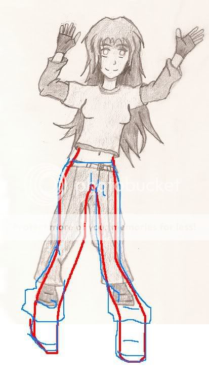
So the legs came out a bit funky using MS Paint(the right leg being to thin and such), but i just wanted to give a general idea that the legs should be longer, unless your making her purposly short?
I think your hands and facde are well done though, and the detail to ^_^

Hope that helps a slight bit o; red lines= body, blue clothes.
|
 |
 |
|
|
|
|
|
|
|
|
|
|
|
|
|
|
|
 Posted: Sun Mar 15, 2009 10:49 pm Posted: Sun Mar 15, 2009 10:49 pm
crying Sorry to hear you don't have your tablet.
Well, I did intend her to be short, but not as short as she ended up being... ^_^ But I still like her overall.
Thanks for the redline and suggestion also!
|
 |
 |
|
|
|
|
|
|
|
|
|
|
|
|
 Posted: Mon Mar 16, 2009 10:43 am Posted: Mon Mar 16, 2009 10:43 am
 There fixed. The problems with your picture: anatomy. All your errors are with anatomy. For example, the upper arm and the lower arm are of the same length, but they do not twist in funny ways. When a body is in motion, you have to consider that the muscles contract in such a way that some positions are just impossible. Your legs have the most visible problems. The average human femurs (the upper leg, thigh) are visibly longer than the lower leg(calf). When aligned, your character is falling to her left because she has no real support in her legs. Her legs and her torso are playing separately.
|
 |
 |
|
|
|
|
|
|
|
|
|
|
|
|
|
|
|
 Posted: Wed Mar 18, 2009 8:53 pm Posted: Wed Mar 18, 2009 8:53 pm
Thanks for the Redline/Redraw. Helps to see it like that a lot.
|
 |
 |
|
|
|
|
|
|
|
|
|
|
|
|
 Posted: Thu Mar 19, 2009 4:48 pm Posted: Thu Mar 19, 2009 4:48 pm
|
|
|
|
|
|
|
|
|
|
|
|
|
 Posted: Fri Mar 20, 2009 1:06 am Posted: Fri Mar 20, 2009 1:06 am
Her body is pretty disproportionate.
I think you should pretty uch take Metapixels advice. ^^
The fingers on her right hand are too short compared to those one the left.
Weird boobs.
Also, her fringe is trange. You have to remember the hair hangs and points down, so those kind of curvy lines wouldn't really be possible.
Also, with the clothes, there are some unnecessary creases, and some places where creases are needed but you can work on that later.
|
 |
 |
|
|
|
|
|
|
|
|
|
|
|
|
 Posted: Wed Mar 25, 2009 12:38 am Posted: Wed Mar 25, 2009 12:38 am
Hmm.
The legs are way too short that's something that immediately caught my eye but there are other anatomical issues as well , the redlines posted above should really help you out a lot.
3nodding
|
 |
 |
|
|
|
|
|
|
|
|
|
 |
|
|
|
|
|
|


