|
|
|
|
|
|
|
|
|
 Posted: Sun Apr 12, 2009 11:13 pm Posted: Sun Apr 12, 2009 11:13 pm
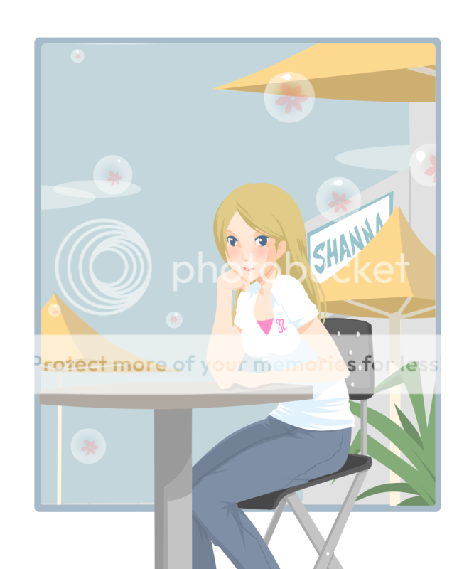
Just something I drew for my girlfriend as a birthday present.
I used her real appearance to make the drawing instead of her avatar...
Oh! and I used a new style! how does it look?

Oh! and sorry for the bright colors, my monitor displays them rather dark so it might be brighter for the rest of you >_<
|
 |
 |
|
|
|
|
|
|
|
|
|
|
|
|
 Posted: Mon Apr 13, 2009 9:55 am Posted: Mon Apr 13, 2009 9:55 am
nice. you still need a little more work, but i love the coloring. heart she's also very pretty!
|
 |
 |
|
|
|
|
|
|
|
|
|
|
|
|
|
|
|
 Posted: Mon Apr 13, 2009 11:16 am Posted: Mon Apr 13, 2009 11:16 am
Nicely done.
It's a minor thing but I feel that there should be something in the left corner of the sky. Just feels empty to me. neutral
Besides the colors being bright for me it is nicely done and I love the style you used. 3nodding
|
 |
 |
|
|
|
|
|
|
|
|
|
|
|
|
 Posted: Mon Apr 13, 2009 11:28 am Posted: Mon Apr 13, 2009 11:28 am
The colors are nice, and I love the overall-vector look.
There are some parts that the colors aren't distinguishable from each other, like her right arm. It's hard to see where the bend in her arm is; try changing the tonal value completely for the top part of her arm so that it becomes a shade, so that depth becomes more of a factor and it's easier to see one part from another.
I think there is something wrong with the alignment of her eyes; she looks a little cross eyed.
|
 |
 |
|
|
|
|
|
|
|
|
|
|
|
|
|
|
|
 Posted: Mon Apr 13, 2009 12:06 pm Posted: Mon Apr 13, 2009 12:06 pm
Kupocake The colors are nice, and I love the overall-vector look. There are some parts that the colors aren't distinguishable from each other, like her right arm. It's hard to see where the bend in her arm is; try changing the tonal value completely for the top part of her arm so that it becomes a shade, so that depth becomes more of a factor and it's easier to see one part from another. I think there is something wrong with the alignment of her eyes; she looks a little cross eyed. I knew it that once I changed the style of the eyes it would look weird D=
In the sketch it's like my other drawings (design and stuff) but I had to change it to that because of vector look gonk
I will change the tone of her arm to make it more noticeable lol
Thank you all for your comments =D
|
 |
 |
|
|
|
|
|
|
|
|
|
|
|
|
 Posted: Mon Apr 13, 2009 6:13 pm Posted: Mon Apr 13, 2009 6:13 pm
What a lovely piece!
Everything seems to be fairly good, except for that negative space in the top left hand corner that someone else mentioned, and her eyes seem a little out of place. One seems to be looking the wrong way or something.
neutral
Hmmm, I can't figure it out.
I do love the new style though, it's very colourful and cheerful. biggrin
|
 |
 |
|
|
|
|
|
|
|
|
|
|
|
|
|
|
|
 Posted: Wed Apr 15, 2009 4:14 am Posted: Wed Apr 15, 2009 4:14 am
Lineless huh? It's really good. I love it. Good proportions and feel.
|
 |
 |
|
|
|
|
|
|
|
|
 |
|
|
|
|
|
|


