|
|
|
|
|
|
|
|
|
 Posted: Sun Aug 30, 2009 9:46 am Posted: Sun Aug 30, 2009 9:46 am
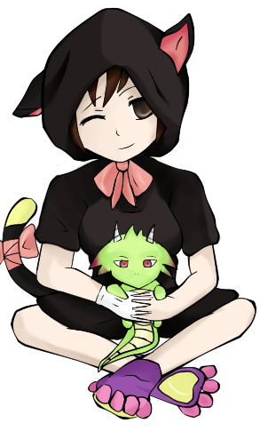
heart heart heart Right, well, I know I'm not all that great, so if anyone's got any tips for me, they'd be gladly appreciated =)
I like this one... It made my avi look pretty cute, I think x3
Feel free to be as harsh as you want... as long as it's constructive =3

You can see some of my other work on my deviantART account.
|
 |
 |
|
|
|
|
|
|
|
|
|
|
|
|
 Posted: Tue Sep 01, 2009 10:21 am Posted: Tue Sep 01, 2009 10:21 am
hmmm thats very good. the eyes need a bit of depth and the drawing need a bit of shading. but the colors are good and it's pretty much unique in the way that most people draw their avi.
|
 |
 |
|
|
|
|
|
|
|
|
|
|
|
|
|
|
|
 Posted: Tue Sep 01, 2009 8:51 pm Posted: Tue Sep 01, 2009 8:51 pm
Your lighting and colouring is really well done. But you need to work on your hands and over all anatomy more. The one foot is twisted around in a way that it would suggest it's broken or placed on backwards. We should not be able to see the pads and toes in that angle.
If you like I can red-line your mistakes for you. As well as point out where you did well.
~b_b_a~
|
 |
 |
|
|
|
|
|
|
|
|
|
|
|
|
 Posted: Thu Sep 03, 2009 5:33 pm Posted: Thu Sep 03, 2009 5:33 pm
broken_bleeding_angel Your lighting and colouring is really well done. But you need to work on your hands and over all anatomy more. The one foot is twisted around in a way that it would suggest it's broken or placed on backwards. We should not be able to see the pads and toes in that angle. If you like I can red-line your mistakes for you. As well as point out where you did well. ~b_b_a~ agreed. i love it though!! :] keep up the good work! practice makes perfect~
|
 |
 |
|
|
|
|
|
|
|
|
|
|
|
|
|
|
|
 Posted: Fri Sep 04, 2009 3:11 am Posted: Fri Sep 04, 2009 3:11 am
broken_bleeding_angel Your lighting and colouring is really well done. But you need to work on your hands and over all anatomy more. The one foot is twisted around in a way that it would suggest it's broken or placed on backwards. We should not be able to see the pads and toes in that angle. If you like I can red-line your mistakes for you. As well as point out where you did well. ~b_b_a~ Thanks! If you wouldn't mind, red lines would be greatly appreciated.
|
 |
 |
|
|
|
|
|
|
|
|
|
|
|
|
 Posted: Fri Sep 04, 2009 1:44 pm Posted: Fri Sep 04, 2009 1:44 pm
the coloring looks good but i tihnk you need to had some more depth to it, also you need to establish a light sorce, the shading looks alittle confuseing to me.
|
 |
 |
|
|
|
|
|
|
|
|
|
 |
|
|
|
|
|
|


