Oops, I rated the first picture 0. The picture and stars didn't load at first, so I thought clicking the link by "rate" would take me to a page where I could see the picture and rate it if I wanted to.
There are two main things I'd consider "problems" with your art. The first is that the rear arm looks dislocated. It's not as bad in the second picture, but still doesn't really match the angle she's on. The other thing that bothers me is how thick the necks are. Not that you have to give them pencil necks like in Sayonara Zetsubou Sensei, but these necks don't look very feminine, to say the least, and they look like they stretch over to one side more than the other.

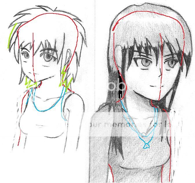
On the left... The green lines indicate how I'd change the hair. Sorta upper-left area, I think it doesn't look poofy enough with my estimated head shape, especially since it's more poofy just a bit higher than that. Blue lines, just some small changes I'd make to the clothes. I think it should wrap a little bit more around her neck rather... Or if it's meant to be loose, you should make it more loose, not like it's still wrapping around tightly. I'd erase some of the breast outline like you did with the long haired girl. I think her eyebrows and the bottom of her eyes don't entirely look in line. I think I've seen artists have a kinda curved line on the eye to the left when drawing faces like this one (curved like a U shape with the bottom of the U being in line with the other eye's bottom, I think). Also, the pupil/iris parts are maybe too different in size.
On the right, that sweater looks like it's oddly loose to me. The necklace should hang more from around the neck, I think, and it looks kinda awkward how you have it end right where the sweater's neck hole area does, almost like you were trying to fit it into a space it doesn't naturally fit in. I erased some of her body to the left below her breasts, so she looks less thick and less like she's about to fall over, though you don't have to make her that skinny. I think her nose definitely looks like it's not where it should be, and the rest of her face also appears a bit off-center to me (I'd move it more to the right). The folds in her skin for her eyelids look really thick; I think you'd be better off just using thin lines for the eyelids. If you look to the right of her eyes, I think her head shape goes outside of her hair a little bit. I'd just add a little more hair there to cover it up.


 Current rating:


 Current rating:


