Welcome to Gaia! ::

The Official How to Draw Manga Guild

Back to Guilds


Tags: artist, manga, anime, draw, learn 

Reply Main Guild Forum
Avi art C&C please![Edited]

Quick Reply

Enter both words below, separated by a space:

Can't read the text? Click here

Submit

Shokotsku

6,550 Points
  • Money Never Sleeps 200
  • Tycoon 200
  • Dressed Up 200
PostPosted: Wed Apr 28, 2010 8:00 pm


I finnally drew my avi!! I know the hair isnt that good but I don't see a problem with anything else, but im sure there's somethin else wrong so....... Critique as harsh and hanus as u want. ^__^
Shokotsku
PostPosted: Thu Apr 29, 2010 4:30 am


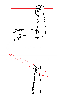
The hand holding the sword isn't bad, but I don't think it matches this pose. I'd have his hand more like one of these...
User Image

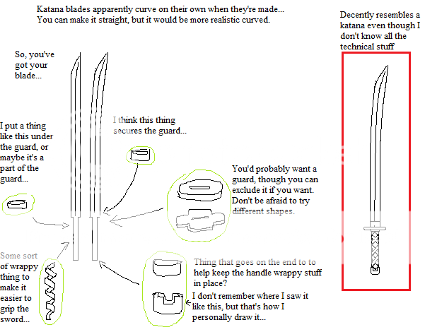
The sword in your picture also has a sorta weird shape. I dunno if you intended that, though.
The katana seems to be missing some important parts... Here's how I draw katanas:
User Image

Face looks good, but sorta off center. I'd shift it all over to the right more.

The pants have no zipper flap thing at the crotch... dunno if you didn't want one? The pants have no belt loops; if the pants are loose enough to need a belt, they'll probably slip past the belt after some movement and fall down.
Is that the seam (part where the pants are sewn together) on the pants? Or pockets? They don't seem to make much sense... And I dunno about your pants, but mine either have the seam on the inner side of the leg or on both the inner and outter sides of the legs. It can help give your drawing depth if you have them on the inner side, at least. With your picture, it looks like the seam is either on the back side or there is no seam.


The belt and cape look good. More specifically, I like the cape around the shoulder area. The anatomy seems pretty good overall, but the arm holding the sword should maybe be shifted over to the left a little.

Zantetsken


Mothily

Noob

PostPosted: Thu Apr 29, 2010 7:10 am


I am REALLY loving the flow of the cape here. It's great, and the hand pulling it down looks really good as well.

Aside from what Zantetsken said, I think the arms are a tad long. I don't really know if they are, but they do look like if you let them unbend/stretch out they'd look long and a bit awkward.

In short though, this is pretty good. C:
♥♥♥
PostPosted: Thu Apr 29, 2010 2:25 pm


I had changed it at school. I changed the hair, changed the cape alittle but its not that noticable, i also changed the face.
Note: I hadn't read the critiques when I had changed it, but ill use u guys sugestions to make it awesomer!
Shokotsku Revised

Shokotsku

6,550 Points
  • Money Never Sleeps 200
  • Tycoon 200
  • Dressed Up 200

G.L.U.E.

PostPosted: Fri Apr 30, 2010 8:48 pm


hmm... the revised version is definitely better but the hand on the chest is in a weird position, the fingers on the hand holding the sword is awkward and the head is a tad small other than those the picture is fantastic 8D good job
Reply
Main Guild Forum

 
Manage Your Items
Other Stuff
Get GCash
Offers
Get Items
More Items
Where Everyone Hangs Out
Other Community Areas
Virtual Spaces
Fun Stuff
Gaia's Games
Mini-Games
Play with GCash
Play with Platinum