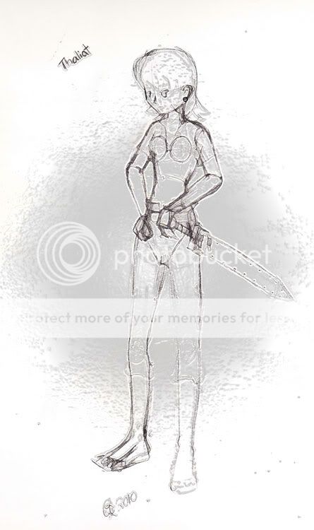
Death T-2
Hark, I rear myself into the guild for the first time in...quite some time.
Welcome back!
Quote:
Seems to me that you have a tendency to draw torsos, limbs, props, etc. all separately rather than treating the body as a whole when you're sketching. You really need to practice gesture drawing and getting that line of motion into your sketches because that will 1) help your anatomy by keeping the body as a whole and 2) communicate a lot more energy through your final work. Props, like the sword there, should be treated as an extension of part of the body so it poses more naturally [which you have a bit of going on. good start].
Yeah. Guilty. The last time I didn't use this method of blocking the body into bits I ended up making a lot of anatomical errors. It was bad. I am doing things this way only as this helps me get a better image in my head of anime anatomy. Maybe then my gesture drawings won't be so embarrassing. But you are so right that I need to get better with gesture drawing.
Quote:
The pose itself is rather awkward as both hands seem to be resting in front while the head is forward in relation to a torso that's seemingly leaning back. Simply stated it looks imbalanced because the hand positions are awkward. I think if you just erase the far hand and treat is as an unseen balled fist the whole thing would look a bit more natural. The legs are spread and bent a little far, so I'm not sure if the character is supposed to be standing or in a half-fighting stance of some kind. Really think about what you want others to think about your pose while you're sketching it out, when you're starting on it you can't be too obvious.
Aside from having an awkward pose, is the anatomy OK? I see what you mean about the hands positions looking...having them both up front like that is a little weird. Cool, now I only will need to draw one hand! And I think I am moving her front leg in a bit since I think she's standing on a hill.
Quote:
Finally, the bellybutton's a little high up.
Aw, hell. I forgot to move it down. In the first version her pelvic area ended up a little too high and that's why the navel is in that position. Totally forgot about it when I fixed her pelvic region...not that it is needed, it was just for help with anatomy positioning. Her shirt is going to hide the navel. Can't believe I left that in when I scanned it.
Quote:
Overall it's pretty OK for a "really rough sketch." You've got some good joints and connections in there. Just don't let anything get too stiff.
Thank you for the advice!
3nodding

