|
|
|
|
|
|
|

Madam Zylphia Von Chasity
|
 Posted: Tue Jul 20, 2010 10:37 am Posted: Tue Jul 20, 2010 10:37 am
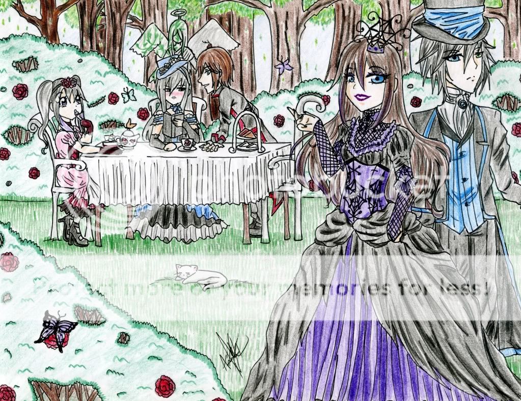
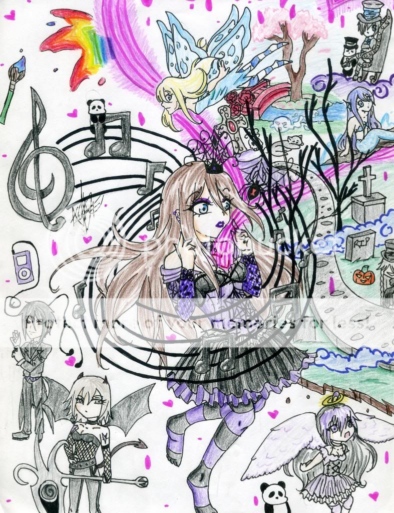
I realize that I am nowhere near the perfect artist, but any constructive criticism is welcome. I will continue to strive to improve my artistic ability! I do believe I have improved a great deal since the last time I posted here. ^^ So here are the two drawings I want critiques on:   Thank you! ^^ heart
|
 |
 |
|
|
|
|
|
|
|
|
|
|
|
|
 Posted: Wed Jul 21, 2010 4:25 pm Posted: Wed Jul 21, 2010 4:25 pm
I love the colors of this picture. I also Like how there so much going on in the picture but there is no cluter what so ever.
|
 |
 |
|
|
|
|
|
|
|
|
|
|
|
|
|
|
|
 Posted: Wed Jul 21, 2010 6:59 pm Posted: Wed Jul 21, 2010 6:59 pm
The design and lines look really nice. I don't see anything wrong, I see something totally cool. smile You have really nice expressions and eye figures. biggrin
|
 |
 |
|
|
|
|
|
|
|
|
|
|
|
|
 Posted: Thu Jul 22, 2010 3:57 pm Posted: Thu Jul 22, 2010 3:57 pm
Cute concepts, I really like the clothing design in the first pic. Victorian/Lolita ftw! XD
However, make sure to watch that arm anatomy. There are a lot of cases where the hand looks weird or twisted strangely. The girl in the purple dress on the top pic, for example, has a hand pointing toward the tea party that looks really strange. It is a really difficult hand pose to work with, which is understandable, but make sure to use references on anything that looks funny.
|
 |
 |
|
|
|
|
|
|
|
|
|
|
|
|
|
|
|
 Posted: Mon Jul 26, 2010 8:27 pm Posted: Mon Jul 26, 2010 8:27 pm
I love these pics!! The backgrounds are amazing. heart
|
 |
 |
|
|
|
|
|
|
|
|
|
|
|
|
 Posted: Tue Jul 27, 2010 1:35 pm Posted: Tue Jul 27, 2010 1:35 pm
I commend you for taking such a risky task!
The first one's got some good details to the hair and the characters look alright, even though they do have some anatomical problems (nobody ever gets it right, either--not even artists like Masashi Kishimoto). However, the main thing I see wrong in the first one is the perspective seems off. It looks like the background doesn't have definite vanishing points, and it doesn't quite line up with your characters.
The second one just seems a bit busy to me, and I feel like it would have been a much easier task to accomplish well if you'd done it either on the computer or with some high grade markers. It's a nice concept, though.
|
 |
 |
|
|
|
|
|
|
|
|
|
 |
|
|
|
|
|
|
