|
|
|
|
|
|
|
|
|
 Posted: Sat Apr 14, 2007 4:55 am Posted: Sat Apr 14, 2007 4:55 am
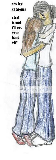
This is Bella and Jacob from New Moon by Stephenie Meyer.
(why? because Jacob is JUST as important as Edward!!)
anyway, i may or may not fix it...
eventually....

|
 |
 |
|
|
|
|
|
|
|
|
|
|
|
|
 Posted: Wed May 02, 2007 7:42 pm Posted: Wed May 02, 2007 7:42 pm
I cant wait until eclipse comes out.
Anywho
It needs for details.
|
 |
 |
|
|
|
|
|
|
|
|
|
|
|
|
|
|
|
 Posted: Fri May 04, 2007 1:59 pm Posted: Fri May 04, 2007 1:59 pm
Yay!
Like I said in the other Twilight/New Moon piece on the board, I'm not yet done with Twilight. Got quite a bit of reading done today, though. Almost done. My friends have New Moon waiting for me, and Eclipse is gonna kill, I can tell.
Now, picture: It's blurry. VERY blurry. Lineart is very messy, and overall those aspects need a good cleanup.
The composition is good. I don't see a lot of Bella Jacob around.
The proportions are alright. Not strikingly good or bad, but alright. I can easily see there's effort in proportion. What strikes me as strange is the size of Jacob's neck (very long and thick), the size of their heads compared to their feet, and Bella's visible arm.
Suggestion: Clean up your lineart and coloring. Try a gum eraser for the colored pencil, and retrace your contour lines SLOWLY in ink. Make sure to take a look at positioning and proportion before you do, though!
Try to define facial features. The right expression in a piece like this can really bring it all together.
Try some more vibrant colors!! I know Jacob's skin is described in detail in Twilight, so use some sienna, perhaps a goldenrod color over it for a healthy glow.
Effort is visible!!! I love the fact that my sheer dumb luck has allowed me to stumble upon another Stephanie Meyer fan like this. Incredible, no? Thanks for being bold and posting your work!!
|
 |
 |
|
|
|
|
|
|
|
|
|
|
|
|
 Posted: Mon Jul 02, 2007 5:34 pm Posted: Mon Jul 02, 2007 5:34 pm
It's good, but it needs more detail and better coloring...
otherwise it's still good!!! i'd give it 8.5/10 4laugh
|
 |
 |
|
|
|
|
|
|
|
|
|
|
|
|
|
|
|
 Posted: Sun Sep 06, 2009 12:38 pm Posted: Sun Sep 06, 2009 12:38 pm
is beautiful!!!!keep it up!
|
 |
 |
|
|
|
|
|
|
|
|
 |
|
|
|
|
|
|

