|
|
|
|
|
|
|
 Posted: Tue Jul 01, 2008 4:41 pm Posted: Tue Jul 01, 2008 4:41 pm
I'm like a cockroach, I just never die or go away.
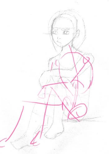
Anyways, I was commissioned to draw someone's OC and this is what I have thus far. Before I draw in any concrete detail, I would love it if someone could point out all the major flaws. Right now, I know the feet are probably too short and there's a line under her butt (which is supposed to be the ground) but I can't see anything else. This drawing is more than likely riddled with anatomical flaws, so... Be as harsh as you want.

|
 |
 |
|
|
|
|
|
|
|
|
|
|
|
|
 Posted: Wed Jul 02, 2008 4:23 am Posted: Wed Jul 02, 2008 4:23 am
well her legs are too short and her but looks like a peice of pizza, jus add more curves and fill her out a bit. and for the body that you can see give her a bit more curves she looks chubby, unless shes supposed to be.
|
 |
 |
|
|
|
|
|
|
|
|
|
|
|
|
|
|
|
 Posted: Wed Jul 02, 2008 7:12 am Posted: Wed Jul 02, 2008 7:12 am
Ahh, okay. I see.
But one thing, where would I add more curves?
|
 |
 |
|
|
|
|
|
|
|
|
|
|
|
|
 Posted: Wed Jul 02, 2008 7:47 am Posted: Wed Jul 02, 2008 7:47 am
He means to make the body more feminine and make her waist line more curved inward.
|
 |
 |
|
|
|
|
|
|
|
|
|
|
|
|
|
|
|
 Posted: Wed Jul 02, 2008 8:51 am Posted: Wed Jul 02, 2008 8:51 am
Hmn... I don't think that you really need to make her 'waist' curve inward because that's not really her waist, it's her back and I think the curve there is just fine ^^ But I definitely agree about the legs and the arm. They need to be a bit more natural.. umm.. I could do a redline later tonight.
|
 |
 |
|
|
|
|
|
|
|
|
|
|
|
|
 Posted: Wed Jul 02, 2008 11:37 am Posted: Wed Jul 02, 2008 11:37 am
Hey Rhiu, well we all know that I can be a harsh critique-er. rofl hahaha.... sweatdrop So, let's get on with it. I second ( or third? fourth?) the legs shortness thing (and the feet, but since you are the one who pointed it out I figure I won't talk about that very much).

1. That foot shouldn't completely touch the ground (everything besides the heel should be slightly off the ground), and the foot should be tilted slightly so you can see some of the bottom of the foot.
2. That leg should go out a little more like that (that segment represents the knee to the ankle).
3. That arm should go slightly downward due to gravity and the fact that she probably isn't straining her muscles to keep it straight. rofl
4. Since she's turned you shouldn't see so much of that shoulder. Also, the arm (unless she's hunching over the keep it in front of her) should hardly be seen if seen at all, meaning the whole of it should be moved back (yes, that includes the hand).
5. That shoulder shouldn't jut out so much at the side; you should actually be able to see the back and the shoulder flow smoothly right there, though the shoulder may be raised up in the shoulder area (like up instead of out).
6. That shoulder (the part from the neck to the arm shoulder thing) should be slightly less slanted due to the fact that her arm shoulder thing in raised. And the neck should flow into the shoulder still.
7. Mentioned before, but butt should be a little more (softly) rounded.
Oh. And I think the curve for the side thing should still be visible, just not too noticeable. So a very slight curve would do it I think.
I liked it though. You know me. I'm prone to details. I swear I've got some mental disorder or something. Anyway, It's pretty good. I'm no good with doing this pose on my own. rofl I like your art. And I enjoy critiquing you (maybe I'm a masochist? twisted Hahahahahaha). Whelp, hope this helped if even a little.
|
 |
 |
|
|
|
|
|
|
|
|
|
|
|
|
|
|
|
 Posted: Wed Jul 02, 2008 11:56 am Posted: Wed Jul 02, 2008 11:56 am
Thank you for all the feed back, guys.
I'll definitely keep it in mind. 3nodding
@Sotalean: Thank you! I was wondering what the heck they meant by giving her more curves. @__@
@Tarff: Thanks for the red-line and tips! I really appreciate it.
|
 |
 |
|
|
|
|
|
|
|
|
|
|
|
|
 Posted: Wed Jul 02, 2008 12:11 pm Posted: Wed Jul 02, 2008 12:11 pm
Hey! You're on! Anyway, Cha Velcome! blaugh I was out yesterday, so there were many new things I had not critiqued. Can't have that. rofl
|
 |
 |
|
|
|
|
|
|
|
|
|
|
|
|
|
|
|
 Posted: Thu Jul 03, 2008 6:49 am Posted: Thu Jul 03, 2008 6:49 am
Hahaha.
Is that so?
You're a critiquing machine, aren't you.
|
 |
 |
|
|
|
|
|
|
|
|
|
|
|
|
 Posted: Thu Jul 03, 2008 11:19 am Posted: Thu Jul 03, 2008 11:19 am
Rhiu Hahaha.
Is that so?
You're a critiquing machine, aren't you.
|
 |
 |
|
|
|
|
|
|
|
|
|
|
|
|
|
|
|
 Posted: Fri Jul 04, 2008 1:32 am Posted: Fri Jul 04, 2008 1:32 am
Hey there! Sorry to bother you. I'm bumping you up. Don't ask why. I'm irritated. And I'm tired. Continue to draw! *Thumbs up* rofl
|
 |
 |
|
|
|
|
|
|
|
|
|
|
|
|
 Posted: Fri Jul 04, 2008 11:44 am Posted: Fri Jul 04, 2008 11:44 am
Hmm... I hear it's a bad thing to bump in this guild. 3nodding
And I shall!
But once again, I would like to thank everyone for their feedback on this particular piece of artwork.
Hopefully the finished product will be much better.
|
 |
 |
|
|
|
|
|
|
|
|
|
|
|
|
|
|
|
 Posted: Fri Jul 04, 2008 3:07 pm Posted: Fri Jul 04, 2008 3:07 pm
love the drawing :] only thing i see is that the build of the person looks kinda big for the rest of the person. other then that it looks good.
|
 |
 |
|
|
|
|
|
|
|
|
|
|
|
|
 Posted: Sat Jul 05, 2008 2:17 pm Posted: Sat Jul 05, 2008 2:17 pm
so you're probably all finished with this drawing long ago, but for some weird reason I wanted to give you my opinion razz and I made a fast redline...in pink, and not too accurate either C: anyway...her back is too stiff, I feel like it would be more natural to curve your back a bit when sitting like that...and also her hip area looked a bit out of place...or something...I'm not good at explaining things XD 
|
 |
 |
|
|
|
|
|
|
|
|
|
|
|
|
|
|
|
 Posted: Sun Jul 06, 2008 7:49 am Posted: Sun Jul 06, 2008 7:49 am
Thank you very much for the red-- er, pink line. C:
I appreciate it.
|
 |
 |
|
|
|
|
|
|
|
|
 |
|
|


