|
|
|
|
|
|
|
|
|
|
|
|
|
|
|
|
|
|
 Posted: Tue Jul 08, 2008 3:28 am Posted: Tue Jul 08, 2008 3:28 am
|
|
|
|
|
|
|
|
|
|
|
|
|
Posted: Tue Jul 08, 2008 9:53 am
|
|
|
|
|
|
|
|
|
|
|
|
|
|
|
|
|
|
|
|
|
|
Posted: Tue Jul 08, 2008 11:23 am
 |
|
|
 |
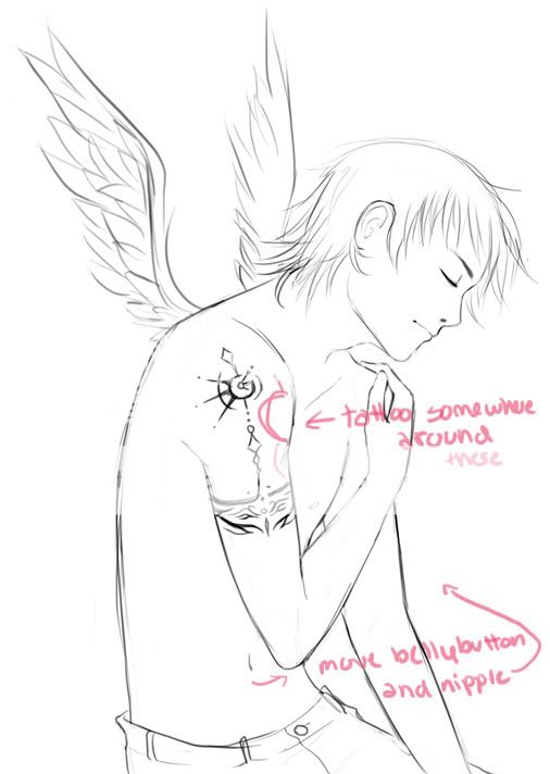
Wow. I really like this picture! blaugh It's really cool. Anyway, I agree with the person above me on everything but the tatto 'cause it looks cool where it is, and it isn't hella off. You can get your tattoos anywhere so they don't really have to be corrected in a picture if they already look pretty. Also, I really like the wings, but I think his left wing (the one away from us should be a tiny bit shorter since ya know it's on the other side. Not too much shorter, just a little. Also, the angle on the other wing may be a little off compared to the one you've got. But I'm not sure about that. Also, I think you might be able to see the base of the wing closest to us a little more. Again, not totally sure since I don't usually see winged people walking around. Either way, your anatomy is really good and your hand looks like a hand, which is a fine accomplishment right there. rofl Congratulations, you have made an excellent drawing. Please continue with it and post the final when you're done! 3nodding
|
|
|
|
|
|
 |
|
|
|
|
|
|
|
|
|
|
|
|
|
|
Posted: Tue Jul 08, 2008 5:06 pm
|
|
|
|
|
|
|
|
|
|
|
|
|
Posted: Tue Jul 08, 2008 5:45 pm
|
|
|
|
|
|
|
|
|
|
|
Posted: Tue Jul 08, 2008 6:36 pm
|
Profitable Conversationalist
|
|
|
|
|
|
|
|
|
|
|
|
Posted: Tue Jul 08, 2008 6:38 pm
|
|
|
|
Very nice, you've got a lot of great things going on in this.
I'd say that the biggest areas you should look out for are in the arms. The near arm looks fine in the shoulder and even in the hand, but the elbow might need a bit more "substance" to it. Making that upper arm a bit thicker could balance the problem a bit better.
The other arm is also very well structured, but the forearm doesn't seem to have any purpose to it. The shoulder there is great, but when you go down the elbow towards the wrist it just seems to stop. Can't tell what position the hand could be in, but worse is that it's hard to determine where the hand could actually start. By adding weight to the lower lines near where the wrist would be, you could still have it "fade out" but still keep a structured anatomy present.
But you've got lots of good things going on in this picture. I love the simple facial features, the wings are very freely done and appropriate, and the tattoo is a great addition in design. What I also really like is the jawline, since it adds a lot of structure and substance in the anatomy, especially with the line that goes down the throat.
|
|
|
|
|
|
|
|
|
|
|
|
|
|
|
|
|
|
|
|
|
Posted: Tue Jul 08, 2008 8:21 pm
|
|
|
|
|
|
|
|
|
|
|
|
|
Posted: Tue Jul 08, 2008 8:47 pm
|
|
|
|
|
|
|
|
|
|
|
Posted: Thu Jul 10, 2008 7:06 am
|
|
|
|
|
|
|
|
|
|
|
|
|
Posted: Fri Jul 18, 2008 4:35 pm
|
|
|
|
|
|
|
|
|
|
|
|
|