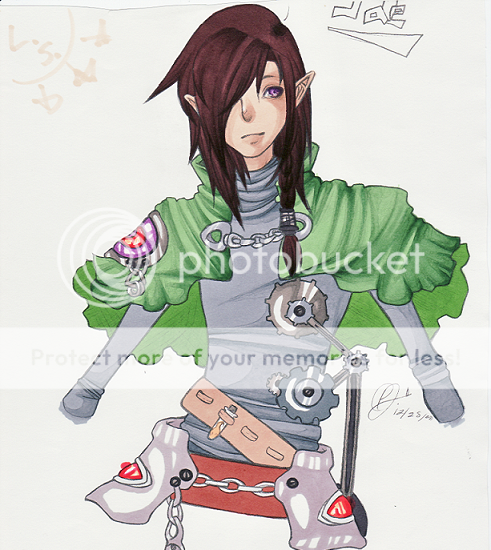
Welcome to Gaia! ::

The Official How to Draw Manga Guild

Back to Guilds


Tags: artist, manga, anime, draw, learn 

Reply Main Guild Forum
Magazine Submission (criticism needed)

Quick Reply

Enter both words below, separated by a space:

Can't read the text? Click here

Submit

Which picture should I submit to the magazine?
  the first picture
  the second picture
  the third picture
View Results

leavyn

PostPosted: Sun Feb 08, 2009 5:33 pm


I'm submitting one of these pictures to the art literary magazine at my school, so naturally I'd like some criticism on the picture.

Though I'd mostly like criticism on the coloring because I know her proportions are off. (It would probably all look a lot better if her hips weren't so wide and her torso was just a bit shorter. Though it would be an epic fail to try and fix that now. Dx )

Sadly my scanner is less than half the size of the original picture so about 60% of this picture was cut off from the scan. So I'm definitely going to submit the original drawing to the magazine.

Edit;; Yes, her hair is meant to be over exaggerated.

User Image

Though I'm either going to submit the picture above or this picture:
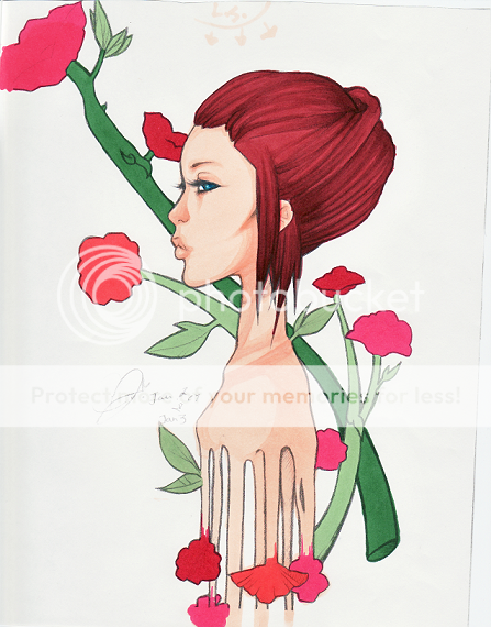
User Image

Or this picture:

User Image

I'm not sure which on I should submit so help with that is loved and so is criticism.
PostPosted: Mon Feb 09, 2009 12:14 pm


The second picture is absolutely amasing smile

For colouring: Maybr add some highlights in the 1sts hair?

tricky_angel


Nagoshi Kun

PostPosted: Wed Feb 11, 2009 9:58 pm


i like the 3rd the best, but all the rest are still nicely done =)
PostPosted: Sat Feb 28, 2009 10:51 pm


I think you made the first one a tad too muscular. ^^" Also, her boobs look a little strange.

shiny dollar


Queen.Trickster

PostPosted: Sun Mar 01, 2009 9:27 am


I'd say to submit the first one.
It is much more dynamic and complete, so it will stand out against other submissions.

I do love the profile and expression of the second one, but its too centered on the page to be dynamic, and I feel that compaired to the first one its a little boring.

The third one needs some serious compositional work (in my opinion), and I highly reccomend not sending it in.

But, they are all lovely drawings, though, and if you put in as much attention to the colored details (like hair) to the first one as you did to the second, I'm sure it will be a sure fire entry~
PostPosted: Sun Mar 01, 2009 3:49 pm


yo ushould send the one at the bottom or in the middle


The Electric Triangle


Thieving Sex Symbol

10,250 Points
  • Married 100
  • Noob wrangler 100
  • Forum Sophomore 300

HannahCan

6,850 Points
  • Member 100
  • Treasure Hunter 100
  • Hygienic 200
PostPosted: Sun Mar 01, 2009 11:11 pm


Of the three you've got up I'd have to say that the 2nd image probably looks the most polished and finished. It's got a nice art deco feel to.
But your best bet is most likely your 1st image. It's a real eye grabber. Yeah, the anatomy looks a little off, but it's kinda of a deliberate off. It's just how the style appears and I don't think it really detracts from the overall affect of the picture.

That being said, I believe the hair could definitely use some more definition to it. I mean it's huge. Make it pop! Don't be afraid to throw some darker colors in there!
You are using markers right? Try playing around with the colors a little on another sheet. That red/pink hair, for instance, might look good with a few brown highlights.

As for your last image; I think looks like an excellent character design but just doesn't catch my attention like the other 2.

I like your little side notes about light source. X3
Have you tried scanning your pictures in sections and then editing them in photoshop? It's a bit of work but it's usually is worth the effort.
Reply
Main Guild Forum

 
Manage Your Items
Other Stuff
Get GCash
Offers
Get Items
More Items
Where Everyone Hangs Out
Other Community Areas
Virtual Spaces
Fun Stuff
Gaia's Games
Mini-Games
Play with GCash
Play with Platinum