|
|
|
|
|
|
|
|
|
 Posted: Mon Mar 16, 2009 3:55 pm Posted: Mon Mar 16, 2009 3:55 pm
|
|
|
|
|
|
|
|
|
|
 Posted: Mon Mar 16, 2009 5:50 pm Posted: Mon Mar 16, 2009 5:50 pm
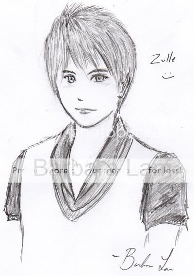
wow its really good! i love how you you did his hair its amazing!
only problem i see is that his right(our left) eye is too close to the other. maybe its just me but seems like since hes at an angle it should be farther away
|
 |
 |
|
|
|
|
|
|
|
|
|
|
|
|
|
|
|
 Posted: Tue Mar 17, 2009 7:29 pm Posted: Tue Mar 17, 2009 7:29 pm
you could just make the eye wider, but that might make it look to big, but I think that his face is just to wide. The left side of his face it tuned away from us, a lil bit, but the right side of his face is shaped like he is facing us directly, thus adding unneeded width. So I think the best solution here would be having the line that comes of his jaw and gos up to his cheek turn inwards more to lose some of the gap between the edge of his face and his eye while also enforcing that he is turning his head ever so slightly away from us.
Also his mouth is oddly wide, not to an extreme, but still on the large side of things given the style, I would either try and make it a little smaller, witch would be wasting very good work, or just add a dimple on the left of it to make it look like he is grinning boldly ;3
great work though smile
|
 |
 |
|
|
|
|
|
|
|
|
|
|
|
|
 Posted: Wed Mar 18, 2009 2:37 am Posted: Wed Mar 18, 2009 2:37 am
Ultra cool. Work on getting your lines cleaner. That's pretty much all I can think of right now.
|
 |
 |
|
|
|
|
|
|
|
|
|
|
|
|
|
|
|
 Posted: Thu Mar 19, 2009 10:46 pm Posted: Thu Mar 19, 2009 10:46 pm
First off, this picture is delicious. I only think you should change one thing. His eye, farthest away. It seems slightly turned; I think you should align it a little bit more with his other eye and you've got it perfect. {In my opinion}. You did a really awesome job; keep it up~! :]
|
 |
 |
|
|
|
|
|
|
|
|
|
|
|
|
 Posted: Fri Mar 20, 2009 6:05 pm Posted: Fri Mar 20, 2009 6:05 pm
shiny dollar Ultra cool. Work on getting your lines cleaner. That's pretty much all I can think of right now. Hahaha, thank you <3 I know, getting the lines cleaner...the only thing is I'm not exactly sure how to do that with all of the mistakes I make -__-; Ty for the help everyone~
|
 |
 |
|
|
|
|
|
|
|
|
|
|
|
|
|
|
|
 Posted: Sun Mar 29, 2009 8:46 pm Posted: Sun Mar 29, 2009 8:46 pm
OMG i luv it biggrin
It's so original...i personally think the eyes look fine as is...the hair is awesome whee
the only possible problem i see is that on the right it looks like u may have started drawing the arm but didn't do so on the other side not making it nsync....if you know what I mean...other than that I think it's splendid! mrgreen
|
 |
 |
|
|
|
|
|
|
|
|
|
|
|
|
 Posted: Tue Mar 31, 2009 6:55 am Posted: Tue Mar 31, 2009 6:55 am
|
|
|
|
|
|
|
 |
|
|
|
|
|
|

