Welcome to Gaia! ::

The Official How to Draw Manga Guild

Back to Guilds


Tags: artist, manga, anime, draw, learn 

Reply Main Guild Forum
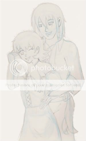
Hand troubles...Couple WIP

Quick Reply

Enter both words below, separated by a space:

Can't read the text? Click here

Submit

What do you think?
  Love it!
  Like it...keep working on it!
  Meh.
  Ehh?!? Why even bother?
  Actually, I just wanted some free gold. ME: Aw...ok, I guess you can still have some
View Results

Thaliat Everwood
Captain

Profitable Conversationalist

9,000 Points
  • Tycoon 200
  • Conversationalist 100
  • Forum Sophomore 300
PostPosted: Sun Mar 22, 2009 11:56 am


So this is my latest project. I'm not loving how the hands came out.
Any advice or tips for fixing this?

User Image
PostPosted: Sun Mar 22, 2009 9:00 pm


User ImageShocking...

The girl's left - my left - hand is all that looks off to me. This looks pretty good, so far, actually.

...isn't it?User Image

Tenko72

Benevolent Genius

13,900 Points
  • Grunny Harvester 150
  • Bunny Hoarder 150
  • Mark Twain 100

Thaliat Everwood
Captain

Profitable Conversationalist

9,000 Points
  • Tycoon 200
  • Conversationalist 100
  • Forum Sophomore 300
PostPosted: Mon Mar 23, 2009 5:30 pm


Yeah...I think it might be a bit too small. I'm still trying to fix it.
PostPosted: Thu Mar 26, 2009 4:49 pm


the guy*taller one?* his right hand seems a bit off...the fingers are either too short or the palm is too big...

EDIT: if you were their point of view it is the right hand...from our point of view its the left one that is hugging her

KeifLover

5,600 Points
  • Member 100
  • Beta Explorer 0
  • Beta Gaian 0

Caliber Mengsk

PostPosted: Sat Mar 28, 2009 1:20 am


Just to state a way I think you could fix your hands a bit is to define the wrists angles a bit more with better lines, making them more defined.
User Image - Blocked by "Display Image" Settings. Click to show.
http://calibermengsk.com/gaia/redline/thaliat.gif

O-o hope the image explains a little of what I mean for that XD Not really the best explanation.

Now, as far as everything else, it seems the girls stomach area is curved outward, and for the kind of person you seem to be drawing it'd be curved more inward then outward (even if she was sticking her stomach outward due to a reaction of the guy, there would still be some curves inward.) Also, it seems to be really pointy at her waist. As well, the guy seems to have heckuva butt. Very curvey, as most male buttocks would be more flat then that.

Besides that, it's a great composition. Maybe you should start trying some folds in the cloth on your next pic. It seems overall proportions are right... at least in my opinion.

As usual, this is just what I see, and you don't have to take any of it to heart. razz Just some suggestions as to ways I would improve it. Hope this helps some razz
PostPosted: Sat Mar 28, 2009 7:50 am


Thanks for the help everyone!

I also noted her left arm is too short as well as too small, I'll be fixing that shortly. redface

@Caliber: Thanks for all the observations. The only one I didn't agree with was the guy's butt...because I think you are looking at the curve of the tail of his sash. I know the blue lines for his hip/butt area are hard to define because of the sash, but I pretty much didn't give him a butt, lol. Good call on her stomach though, that had been bugging me and I wasn't sure why. I'll be fixing that! You red lines helped a lot on the finger placement, thanks!

Thaliat Everwood
Captain

Profitable Conversationalist

9,000 Points
  • Tycoon 200
  • Conversationalist 100
  • Forum Sophomore 300

Caliber Mengsk

PostPosted: Sat Mar 28, 2009 1:13 pm


No problem blaugh I always enjoy helping, and I'd have to say the shape of the hands are my strongest point... O-o though, size of the had. XD I tend to be a bit small on.

^_^ Glad I could be of service though.
PostPosted: Sun Mar 29, 2009 12:23 am


I think it looks really good, but I think if you were to lean the girl back onto the other's chest as if she were relaxed or feelin' reeal good than it wouldn't look so awkward. Also, when you do this you might want to lower the angle of his elbow and arm since he'd want to be pressed against her and not just diggin' at her breast. redface
Now I was assuming that the picture was a love not a rape scene, if I was wrong than you'll want to show that she is struggling more and perhaps blushing more, he on the other hand is either super strong or you need to show that he is struggling to hold her back against him. 3nodding heart
P/s I hope it helped and you got what you needed since I feel that your hands were very well done and that the other body parts mentioned above was the cause of any awkwardness the drawing might have had. heart

Un-Chien-1

Shadowy Shapeshifter

6,400 Points
  • Brandisher 100
  • Hygienic 200
  • Forum Regular 100

Thaliat Everwood
Captain

Profitable Conversationalist

9,000 Points
  • Tycoon 200
  • Conversationalist 100
  • Forum Sophomore 300
PostPosted: Fri Apr 03, 2009 10:23 pm


Hm...I actually want there to be little bit of awkwardness in this sketch because there is a bit of awkwardness in their relationship. I could shift the positioning of her hips to make her lean back a little, but I think it might be getting a little too cozy...not sure yet.

Granted, he isn't supposed to look like he's "diggin' at her breast"...I'll have to see if I can put some shadow under the hand to give it the look of hovering a bit above or something, but that will come at the coloring stage.
PostPosted: Sat Apr 04, 2009 6:51 pm


her boob looks like its up to high

but maybe thats just me


The Electric Triangle


Thieving Sex Symbol

10,250 Points
  • Married 100
  • Noob wrangler 100
  • Forum Sophomore 300
Reply
Main Guild Forum

 
Manage Your Items
Other Stuff
Get GCash
Offers
Get Items
More Items
Where Everyone Hangs Out
Other Community Areas
Virtual Spaces
Fun Stuff
Gaia's Games
Mini-Games
Play with GCash
Play with Platinum