Welcome to Gaia! ::

The Official How to Draw Manga Guild

Back to Guilds


Tags: artist, manga, anime, draw, learn 

Reply Main Guild Forum
Would Like Help/Critique

Quick Reply

Enter both words below, separated by a space:

Can't read the text? Click here

Submit

Zx JoKeR xZ

PostPosted: Mon Jun 22, 2009 10:53 am


Ok So I've got two pics here: one of an OC of mine and a wolf i did for a commission. Here's my OC.

http://i81.photobucket.com/albums/j238/MewInu/pier.jpg

I'm basically asking for critique. Ignore all the shadowy parts it's from my scanner and I didn't outline it.

Second picture:

http://i81.photobucket.com/albums/j238/MewInu/CHO.jpg

More so asking for help with Photoshop coloring. Anyone have any tips or tricks for it? Thanks and I'll only take constructive critisism.
PostPosted: Thu Jun 25, 2009 10:49 pm


One way to really improve the OC is adding wrinkles and fold into his clothing along with other little details Adding a line to show where the fabring is sown together is a simple way to add details. showing a button and that part where you have to zip up is a pretty nice little detail too.

I also think that the arm may be a bit too thin and the a hand too small, but other than that it's pretty good.

I would say the legs are too short but that varies from style to style so yeah...
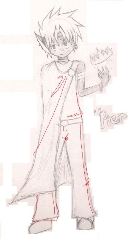
User Image

The wold picture is so cute! XD
I'm not really an animal drawer so I can't help you there sweatdrop
However I can say that my favorite tools in photoshop is the burn tool (a hand) and the dodge tool (a black magnifying glass thingy) the burn tool makes things darker so it helps makes shadows on things that already have color. The dodge tool will make things lighter showing where the light is. =)

AppleStreet


Zx JoKeR xZ

PostPosted: Fri Jun 26, 2009 5:39 pm


Thanks much ^^ And I kinda gave up on the hand XD I don't like big fat arms.
PostPosted: Sat Jun 27, 2009 1:13 pm


First picture:

In general this one looks really nice... just like some daredevil with a kind haert.
I really like the way you drew his face, but one can see that you are not as good with anatomy of bodies yet...
Don't try to hide parts of the picture...
you really should draw BOTH arms. - Even if you want to cover it.
Because then you avoid having this "one armed feeling" you get from the fact that his coat does flow like there is no arm under it at all.

The other hand looks quite nice so far... apart from some anatomy things I don't want to mention right now.


The second one:

Since you want critic in colouration I will not mention the anatomy and detail of this really cute foxy thing.
It's quite great.

The coloration yet is not thaaaat perfect to my eyes for you made NO shadows and no light effecty at all. - And you did not even try to work with fur details and feathers.

- Next time you better should use some photo-references and ... SHADING SHADING SHADING.
Even white fur has shadows.

Adrian Sage

3,550 Points
  • Beta Critic 0
  • Beta Citizen 0
  • Citizen 200

opiel16

PostPosted: Sat Jul 04, 2009 10:23 am


You've discovered layer masks, right? They're the most awesome thing ever, because you just fill a layer the colour you want, mask where you don't want it and then put texture and shadows and whatever all over, and you don't need to worry about going over the edges at all.
Second most awesome is the thing where you change the lineart layer to darken. So you don't have to delete the white bits.
IT just makes colouring easier, so then you can have a go at more complex shading and texture, that sort of thing. I mention these becuase I've had photoshop at least six years, and only just figured this sort of thing out!
PostPosted: Wed Jul 15, 2009 3:57 pm


First picture:
The others have pretty much covered what I wanted to say. The face and ear (wait, only one ear?) is adorable >w<
I've spotted a quite common problem on the hand - I tend to see it on my own pictures when it's all inked and coloured... The fingers are 'slipping down', and look generally crooked (well, fingers tend to be, but they usually bend the same way). Ask someone to hold their hand as if they were throwing something away. The fingers are attached to the hand in a line, that can be more marked out by making a faint irregular line where the knuckles are smile

Second picture:
Don't be afraid of shading! I don't have photoshop, but another program that works basically the same way but that no one seems to have heard of. Anyway, shade shade shade - and then put in highlights! Find a light source and all that (this will go on forever if I keep ranting on that - and there's plenty of tutorials anyway)
Then smudge. I can't say how much I love smudge when it comes to shading. Many a great artist can do without smudging, but I suggest you gives it a shot - you just might discover that you like the effect :3

abandoned_nr_5448214

Gambino Gaian

Reply
Main Guild Forum

 
Manage Your Items
Other Stuff
Get GCash
Offers
Get Items
More Items
Where Everyone Hangs Out
Other Community Areas
Virtual Spaces
Fun Stuff
Gaia's Games
Mini-Games
Play with GCash
Play with Platinum