Welcome to Gaia! ::

The Official How to Draw Manga Guild

Back to Guilds


Tags: artist, manga, anime, draw, learn 

Reply Main Guild Forum
Looking for some crituques, I am :D

Quick Reply

Enter both words below, separated by a space:

Can't read the text? Click here

Submit

cyberlation

PostPosted: Mon Mar 15, 2010 6:13 pm


User Image
PostPosted: Mon Mar 15, 2010 6:56 pm


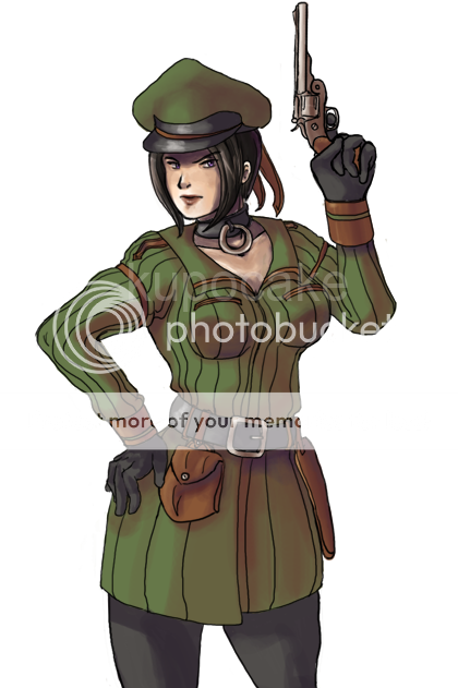
Im no expert but I think your proportions are wrong, you know how they say the top has to equal the bottom, aka your legs are to short in my opinion

Leazard

5,450 Points
  • Beta Gaian 0
  • Beta Citizen 0
  • Beta Forum Regular 0

cyberlation

PostPosted: Mon Mar 15, 2010 7:03 pm


Oh, I cropped them, you see. I simply left the bottom portion of her legs out.
PostPosted: Tue Mar 16, 2010 12:43 am


It's very hard to see the lineart for the skin color. I have no problems seeing the lineart for the hair or the clothing, but the skin to me seems to be blending in all with one color, like some kind of strange vector.

I like the fact you put the back of the hair in a darker color to show depth. Perhaps do the same thing with, say, the neck? Choose a darker skin tone color that also has some other hues. I personally like using a slightly reddish hue with my skin shade color, but I've seen it pulled off with an orange/brownish and even purple.

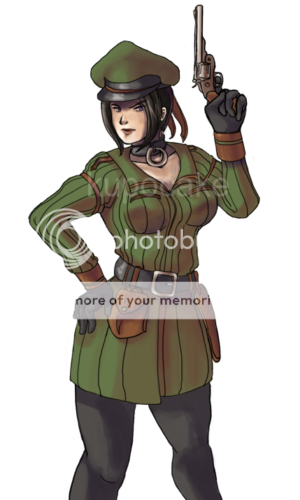
Anyway, I'm not digging where the girl's legs were cropped at. One of the biggest no-nos of design/composition is cropping off a body part at the joint. Why? Because it makes them look like amputees. If you crop at mid-thigh or mid-calf instead, it will imply that there is "more to the body" left. Cut it at a joint and you'll have problems.

I'll butcher my character just to show you. Here.
Here's cut mid-calf.
User Image

Now here's cut at the knees.
User Image

The first one feels like there's more left to the eye, that you're fully aware that this is cropped. The second one makes her legs look like it ends right there, in weird stumps. Get what I'm saying?

Kupocake
Vice Captain

Dangerous Capitalist

7,650 Points
  • Popular Thread 100
  • Entrepreneur 150
  • Profitable 100

Zantetsken

PostPosted: Sat Mar 20, 2010 6:51 pm


With the way the legs were cropped, it almost made me think that's where the pants were being pushed up due to the feet/shoes sticking out from there. Her raised arm appears to be longer than the other arm. The cropped point doesn't look like the knees to me since the arm that's down isn't reaching down to the middle of the thighs, unless those pants are being worn low (which it sorta looks like), in which case it looks to me like the knees would literally just be in the middle of the shown pants.

The skin colour's shading/line art is barely noticeable at all, as Kupocake says.


Other than these things, I think it looks pretty interesting and good overall. The design on the shirt, for example (or pretty much anything else I haven't mentioned at all).
PostPosted: Tue Apr 06, 2010 11:48 pm


i think you need to define the difference between the chin and neck better.

chron_121

4,600 Points
  • Citizen 200
  • Entrepreneur 150
  • Full closet 200

Aria-sama

Blessed Gaian

9,700 Points
  • Contributor 150
  • Treasure Hunter 100
  • Tycoon 200
PostPosted: Fri Apr 09, 2010 7:13 am


I like it it's a simple looking in the colors and pretty clean. I think it is a bit stretch the proportions but overall well done. There needs to have some more outline to define the fingers and chin. maybe a little more darker color to define it more.
Reply
Main Guild Forum

 
Manage Your Items
Other Stuff
Get GCash
Offers
Get Items
More Items
Where Everyone Hangs Out
Other Community Areas
Virtual Spaces
Fun Stuff
Gaia's Games
Mini-Games
Play with GCash
Play with Platinum