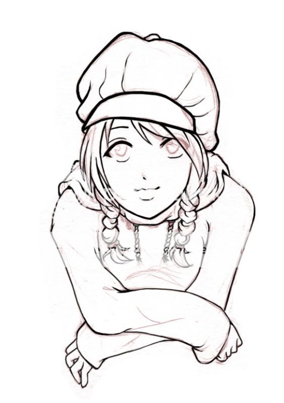
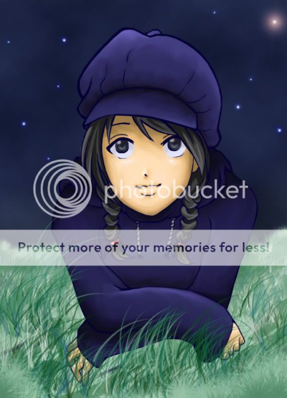
I think the colouring on the hair looks particularly good. I don't think you should've made the entire line art purple, though. I would've just left it all black and maybe changed it on certain parts of the sweater and hat (where it wouldn't mess with the other parts of the drawing)... Though I'm not familiar with Photoshop at all, so I dunno if there's an easy way to do that or not.
For her pose, I think she looks more like she'd be leaning over a fence, counter, or something similar. When I first saw the line art, I thought it was either supposed to be something like that or that she was perhaps taking her top off. It seems like she's supposed to be lying down, though. I have no idea how to do it... I drew something in a very similar pose before, but it didn't work out for me. I suppose the chest might be closer to the ground, but I really don't know and need to research it more.
Light source... it seems like it might be from where she's looking at, and it also looks like it's coming from that shining star in the background. I think that star is applying to her hat while the source in front of/above her seems to be applying to most everything else... Or maybe it's the dark shoulders that I have a problem with; if the light from above/behind is strong enough to make the top of her hat brightened, then I'd maybe make the top of her everything brightened (unless it's under something that would cast a shadow).
I dunno, the colouring/shading seems good overall, but something seems amiss.
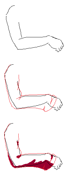
I would have personally shaded her right forearm differently. Here's a picture showing how I'd have done it (just a quick MS Paint thing):

As your picture is currently, I don't think the shape of her arm is made evident enough... or maybe I got the wrong idea here. Well, that's how it looked to me, anyways. Otherwise, I'd give that arm less curve on the top of the sleeve... I guess when going from point A to point B, gravity would make the top of [whatever loose thing you've drawn] more straight.
Well, these are my views. The picture looks quite nice overall.


