|
|
|
|
|
|
|
|
|
 Posted: Mon Apr 05, 2010 1:12 pm Posted: Mon Apr 05, 2010 1:12 pm
Hey there How to Draw Animu Guild! Figured that since I have a few new images as of recent, I would ask for some critique from this guild once again. I've been fiddling with Photoshop, trying to sketch whenever I can, so now I want to hear people yell at me.
ANYWAY, this stuff is on my Deviantart, but for the sake of this post, I put stuff in Photobucket. HERE YOU GO GUYS!
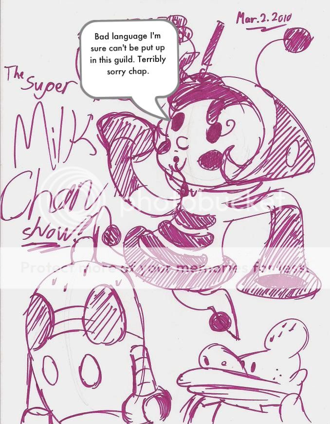
Super Milk Chan Sharpie doodle. Uncensored bubble is on DevArt, but we have to censor here I think.

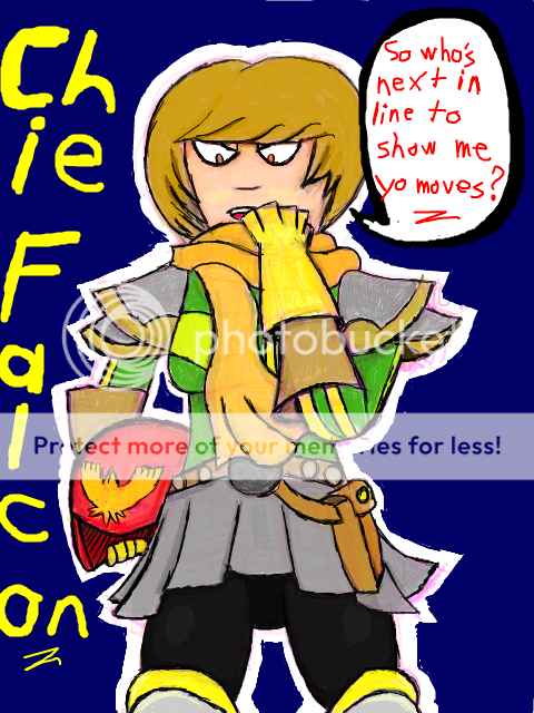
Tegaki E drawing of Persona 4's Chie Satonaka with Captain Falcon outfit components. Because no one has drawn this yet.

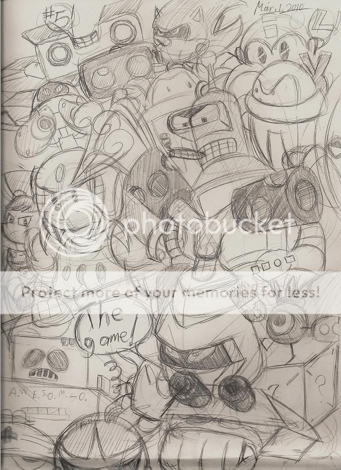
Final page of my last sketchbook, which was drawn on March 1st. Drawing lots of robots is fun, but drawing non-complicated robots makes me regret staying in my comfort zone.

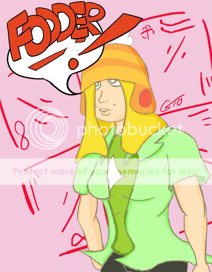
Photoshop color practice done today of my OC Melanie Lee. Wanted to play with a larger image size and outline the character in grey instead of solid black. Anatomy is ultra wonky. She's also saying fodder because the story I've planned for her is called "Cannon Fodder".

Let's here those criticisms!
|
 |
 |
|
|
|
|
|
|
|
|
|
|
|
|
 Posted: Mon Apr 05, 2010 4:29 pm Posted: Mon Apr 05, 2010 4:29 pm
1st picture: A rather cartoony looking style, which pretty much means "anything goes", so I dunno what to say about it. The hole at the end of the arm to our right could perhaps match the shape of the arm's end better.
2nd picture: Kinda cartoony again, and I dunno what Persona 4 is or what sort of style it uses. The eyes look too close together, I think. I'd move the eye on the right more to the right and center the nose/mouth based on the new position. The head shape looks weird, but... well, what I said in the first sentence. If we're viewing from below, we should probably see nostrils, not some nearly flat line for a nose. Actually, the upper half of the body pretty much looks like a front view instead of from below. The colouring and shading could be better; you can see the ways the colours were stroked, and you can see some white spots inbetween.
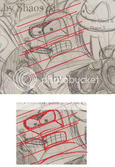
3rd picture: Hack and Slash look about right. Bender's eyes look off; the frame thing that goes around his eyes isn't in line... it's not in line with his mouth or with the base of the frame thing (where it connects to his head). The eye sizes are also too different. I'm not really familiar with the other robots, but it's a pretty cool picture overall.
4th picture: Shoulders are rather broad, white diamond thing on the shirt doesn't look centered, arm to our left doesn't seem connected to the body... The shading looks ineffective, but the colours are pretty interesting. Arm to our right looks rather chunky, seems sorta weird how it gets skinny at the wrist... I dunno if an overweight person's wrist area would also be fat or not, though. Arm to the left just seems kinda blobbish.
The darker green shirt underneath comes over the lighter green shirt at the stomach... Makes that lighter green shirt look awkward there to me. It looks like it should go over, or it should be changed to fit its position better (e.g. being able to see some of the inner side).
|
 |
 |
|
|
|
|
|
|
|
|
|
|
|
|
|
|
|
 Posted: Mon Apr 05, 2010 9:14 pm Posted: Mon Apr 05, 2010 9:14 pm
Fun time! Some critique. Thanks Zantetsken! Now let's see...
1st image: Fully understand the whole, well, hole problem you see. I see the issues with the hole in her left sleeve, as well as the fact that the same arm seems way too small. Milk-chan is meant to be cartoony in the first place, but to an extent. She's like the Ren and Stimpy of anime, but a lot more mellow and a lot like something John K. himself would despise.
2nd image: Persona 4 is a JRPG made by game company Atlus. It's yet another addition to the bulky Shin Megami Tensei series. As a JRPG, it uses JRPG anime. Here's Chie in the P4 anime style. Now that I look at what you said, I see some big issues in the right eye and the overall eye placement. At the time I was going for more of a Megaman eye style for Chie (akin to robots like Snake Man, Gemini Man, Flash Man, etc). The nose, sorry about that. I should have tried for nostrils to give more of the idea of a below view. Maybe when I drew this I should have made the size of the waist and legs somewhat larger to give a better idea of the bottom view as a whole, make it flow with the upper half. As for the coloring as a whole, this was my second shot at utilizing the opacity tool on Tegaki E and trying to blend colours. I haven't done a lot of colouring to begin with, BUT HEY THAT'S NO EXCUSE OH CRAP I NEED TO STRAIGHTEN UP.
3rd picture: OH SHI, you recognized Reboot?! +50 for you man. I don't know where, but hey, +50. Also, no matter how many times I draw him, Bender always looks really iffy. His legs, his eyes, the overall structure, everything. I've watched Futurama so much, yet I can't figure out Bender! I should have shaded a little more on the sides of his, well, bending unit eyes I guess. I've never really looked at concept sketches for Bender before either, so maybe I should take a look and see what I can learn from them to make him look tolerable. I use references for him of course, but I've never watched one of those DVD videos where they sketch him.
4th picture: Oh god, I went back to this trend it seems. I've got the broad shoulder criticism before, but it doesn't seem like I applied it very well. I agree completely with all the anatomical issues you see here. It was just a lot of laziness on my part due to the fact that I was focusing more on outlining and coloring the sketch. Really shouldn't have done that. I get what you're saying about the clothing at the stomach area though. I think maybe emphasizing the fact that the right side parts of the light green shirt near the stomach are further away from the viewer than the dark green shirt would make this look a lot more sensible. Distinguish the colours enough to give the idea of how far away the shirt is to the viewer. Still, I can't help but despise the left arm. I have no clue what I was thinking with it. sweatdrop
Anyway, thanks for all that Zantetsken. Been a long time since I got some extended criticism!
|
 |
 |
|
|
|
|
|
|
|
|
|
|
|
|
 Posted: Tue Apr 06, 2010 6:04 pm Posted: Tue Apr 06, 2010 6:04 pm
Good ol' Reboot. Now I wanna rewatch it... You should normally be able to fit one eye's width inbetween your eyes, but it looks like the style in Persona 4 has the eyes spaced even farther apart than that. You can also see the eyes farther apart like that in Spirited Away, Ichigo 100%, sometimes in Billy Bat, and various other manga/anime... Anyhow, if you wanted to imitate the style a bit, you may want to consider having the eyes spaced far apart like that, too. I think your Bender looks pretty good overall. Of course, researching him a bit more can only help you, so that would be a good idea. I think you mostly just need to line things up a bit better, though. 
|
 |
 |
|
|
|
|
|
|
|
|
|
 |
|
|
|
|
|
|
