|
|
|
|
|
|
|
|
|
 Posted: Sun May 23, 2010 6:58 pm Posted: Sun May 23, 2010 6:58 pm
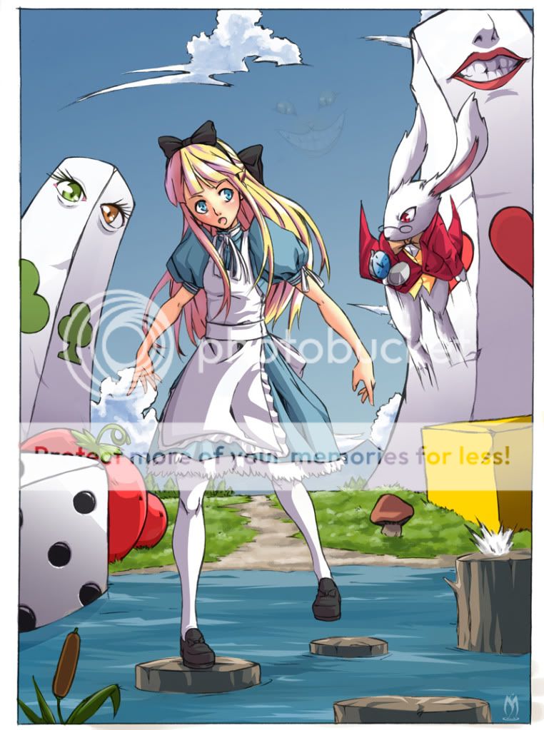
 Commissioned by a very good friend of mine heart You think it's good enough? surprised
|
 |
 |
|
|
|
|
|
|
|
|
|
|
|
|
 Posted: Sun May 23, 2010 7:07 pm Posted: Sun May 23, 2010 7:07 pm
I love this. I like the colors....and the creepy faded cat grin. You are always so good with details. I think it is good.
|
 |
 |
|
|
|

Profitable Conversationalist
|
|
|
|
|
|
|
|
|
|
|
|
 Posted: Sun May 23, 2010 8:05 pm Posted: Sun May 23, 2010 8:05 pm
Woah this is great! I love how there are details that are so subtle and catch your eye the second time around, like the Cheshire cat grin! Plus I LOVE Alice and Wonderland (the original! I havent seen the new one!)
So... overall 20/10~
|
 |
 |
|
|
|
|
|
|
|
|
|
|
|
|
 Posted: Wed May 26, 2010 9:34 pm Posted: Wed May 26, 2010 9:34 pm
Thank you!
Although it wasn't what she was expecting, she really liked it and now she wants to frame it =D!!!
|
 |
 |
|
|
|
|
|
|
|
|
|
|
|
|
|
|
|
 Posted: Fri May 28, 2010 2:17 pm Posted: Fri May 28, 2010 2:17 pm
nice, and yes it is really frame worthy!!! color give it a magical and live feel, makes the drawing seem like its coming to life! tell ur friend to keep up her good work ;]
|
 |
 |
|
|
|
|
|
|
|
|
|
|
|
|
 Posted: Fri May 28, 2010 8:38 pm Posted: Fri May 28, 2010 8:38 pm
xKUR0GANEx nice, and yes it is really frame worthy!!! color give it a magical and live feel, makes the drawing seem like its coming to life! tell ur friend to keep up her good work ;] Thank you, although it was I who drew it lol
|
 |
 |
|
|
|
|
|
|
|
|
|
|
|
|
|
|
|
 Posted: Sat Jun 05, 2010 12:45 am Posted: Sat Jun 05, 2010 12:45 am
I love your work, there's so many emotions and feelings that come through in your pieces. YOu convey them very well and i can keep looking and finding new things each time I look at your picture. (the smile of the cheshire cat for instance)
There's a couple anatomy errors in the legs/feet and the hair looks to be sitting a little high on the head, but other than that an AMAZING piece of art.
|
 |
 |
|
|
|
|
|
|
|
|
|
|
|
|
 Posted: Sat Jun 05, 2010 3:29 am Posted: Sat Jun 05, 2010 3:29 am
wow
well i think its amazing
i love it ^^
do more :]
|
 |
 |
|
|
|
|
|
|
|
|
|
|
|
|
|
|
|
 Posted: Tue Jun 08, 2010 11:23 am Posted: Tue Jun 08, 2010 11:23 am
Everything has a fantasy kind of vibe to ti. The rabbit looks serious and determined. The green and orange eyes look really mysteriously cynical. The cat's face being dimly placed in the sky really makes everything creepy. Nice job!
|
 |
 |
|
|
|
|
|
|
|
|
|
|
|
|
 Posted: Fri Jun 25, 2010 2:28 pm Posted: Fri Jun 25, 2010 2:28 pm
Wow!! eek eek eek eek eek eek eek It's really amazing, are you human?? rofl rofl rofl
Seriously, I like it a lot!!!!!
|
 |
 |
|
|
|
|
|
|
|
|
|
|
|
|
|
|
|
 Posted: Tue Jul 06, 2010 2:50 pm Posted: Tue Jul 06, 2010 2:50 pm
Your background elements are inconsistent with your light source [pillars, boxes, mushroom, stumps], and even the rabbit. Actually, it looks like everything except Alice and the tomatoes has the same light source. The rabbit's ears make terrible tangents with the pillar, which causes a lot of confusion for the eye; break that up by moving the ears. Cheshire cat is too low of an opacity; it should be more visible so that it harmonizes with the rest of the image.
Then...I just have to question why Alice has her hands like that in such a pose. The raised foot is also awkward, because if she was stepping with it we would see more of the top of her shoe rather than have the same angle as the planted foot. The raised leg could also use a bit of foreshortening.
Overall you've put in some good effort, but the elements I mentioned keep it from being so much better.
|
 |
 |
|
|
|
|
|
|
|
|
|
|
|
|
 Posted: Sat Jul 10, 2010 5:39 am Posted: Sat Jul 10, 2010 5:39 am
Death T-2 Your background elements are inconsistent with your light source [pillars, boxes, mushroom, stumps], and even the rabbit. Actually, it looks like everything except Alice and the tomatoes has the same light source. The rabbit's ears make terrible tangents with the pillar, which causes a lot of confusion for the eye; break that up by moving the ears. Cheshire cat is too low of an opacity; it should be more visible so that it harmonizes with the rest of the image. Then...I just have to question why Alice has her hands like that in such a pose. The raised foot is also awkward, because if she was stepping with it we would see more of the top of her shoe rather than have the same angle as the planted foot. The raised leg could also use a bit of foreshortening. Overall you've put in some good effort, but the elements I mentioned keep it from being so much better.
Wow, I thought it sucked but not THAT bad surprised
|
 |
 |
|
|
|
|
|
|
|
|
|
 |
|
|
|
|
|
|

