Welcome to Gaia! ::

The Official How to Draw Manga Guild

Back to Guilds


Tags: artist, manga, anime, draw, learn 

Reply Main Guild Forum
Nathan | Comment and Critique?

Quick Reply

Enter both words below, separated by a space:

Can't read the text? Click here

Submit

.
  .
View Results

[.Potemkin.]

PostPosted: Fri Jun 04, 2010 12:40 am


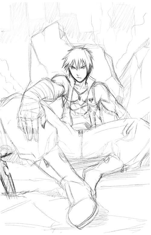
Well, since I was actually trying to come up with a design for a RP character, I started doodling and sketching a random figure...

I'm not sure if the proportions are right or not, but this is what I could come up with.

User Image

Comment and critique? surprised
PostPosted: Fri Jun 04, 2010 1:54 am


omg first of all I love you'r scanner can u tell me which one u'r using cuz mines makes my drawings darker, and the drawing looooveeee it!

electro_magnet


alcor_psythe

1,050 Points
  • Beta Forum Regular 0
  • Beta Critic 0
  • Beta Citizen 0
PostPosted: Fri Jun 04, 2010 4:16 am


first of all, great job with his upper body and face expression, it suits him well.

One thing that caught my eye, because i think something is wrong with it is the size of his legs...they are big. I know theres this law on foreshortening wherein, the object or part nearer to the observer's eye is bigger compared to other parts. But in this picture...soemhow the connection to his torso and his legs are a bit awkward, how about adjusting the leg size? Specially on the part where it bends (that is on his right knee)?

That is all, its just his legs that bother me...the other parts of his body is good! wink
PostPosted: Sat Jun 05, 2010 12:18 am


I think what you're seeing Alcor is the fact that the left thigh is MUCH longer than the right thigh, so it throws off the proportions a bit. Forshortening makes stuff closer to us larger but it also makes the object comming at us shorter.

I think if you shorten the rightleg about by half it'll look alot better.

(left/right as in us looking at it not his left/right)

Also, the pose of the legs doesn't quite give the feeling that I think you're going for here. relaxed legs like that give a feeling of lazyness/relaxing. I would at the very least take the left lower leg and position it straight up and down, it should give the picture a much better feeling of strength.

If it's supposed to be "lazy" or "relaxed" then i would change the expression on his face

Also, his left arm would be bent resting like that on a bent leg, having a straight arm makes it look like he's reaching out at something and not resting on his thigh/knee. there's also some foreshortening errors going on there. he's reaching out almost directly at the camera, the top of the arm would be seen more than the side, and most of it would be obscured by the hand/forearm. The right arm doesn't really look like it's supporting his weight at all, and it's kinda at an awkward angle to be resting on something, so maybe bring it in towards the torso a little more.

You have a very powerfull image happening here, the feeling comes through very strongly and overall the quality of the drawing is awsome. I hope to see this completed in the near future.

Edit: i hope you don't mind but I threw together a redline skeleton to show what I'm talking about a little better. Redline (sorry about the quality of the lines, usually use my tablet but don't have it with me at the moment, so it's all mouse XD like drawing with a bar of soap.)
FllnFalcon

Reply
Main Guild Forum

 
Manage Your Items
Other Stuff
Get GCash
Offers
Get Items
More Items
Where Everyone Hangs Out
Other Community Areas
Virtual Spaces
Fun Stuff
Gaia's Games
Mini-Games
Play with GCash
Play with Platinum