|
|
|
|
|
|
|
|
|
 Posted: Fri Sep 17, 2010 9:26 am Posted: Fri Sep 17, 2010 9:26 am
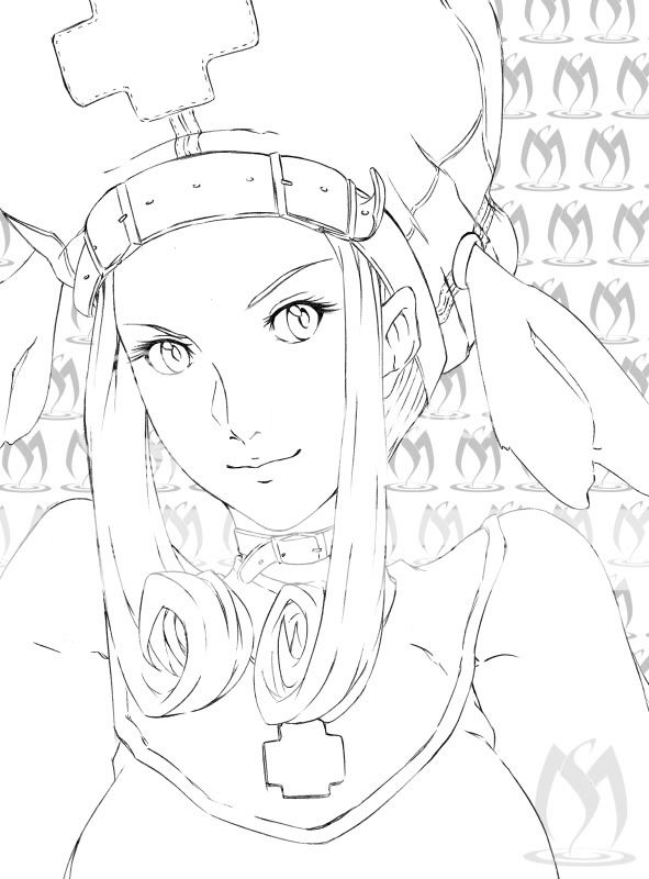
Just a drawing featuring Fanny from Guilty Gear series. I used a sucky ball point pen and an HB2 pencil for the sketching. Estimated time: around 30-40 minutes  Feel free to color it and post here your result =D! And don't forget to critique and comment!
|
 |
 |
|
|
|
|
|
|
|
|
|
|
|
|
 Posted: Fri Sep 17, 2010 10:54 am Posted: Fri Sep 17, 2010 10:54 am
*grabs crayon box*
It looks cool! I'mma gonna color this So HARD!
Also, the boobs don't look quite right. They're not very proportional, shape doesn't fit with size, and a little low/saggy, but all that could just be your style. . . . >_< Everything else is awesome! :3
Mod's note: Please don't post other images in an artist's thread! It can be considered rude. Check out the rules or PM one of our mods if you need any help. <3
Edit: Note to mod - sweatdrop sorry, that was my new place saver. oops. . .
|
 |
 |
|
|
|
|
|
|
|
|
|
|
|
|
|
|
|
 Posted: Fri Sep 17, 2010 9:50 pm Posted: Fri Sep 17, 2010 9:50 pm
oh wow! you're really good!
|
 |
 |
|
|
|
|
|
|
|
|
|
|
|
|
 Posted: Sun Sep 19, 2010 12:01 pm Posted: Sun Sep 19, 2010 12:01 pm
This is lovely! The lines are really crisp and clean. The only thing I can critique on is that the eyes look a bit far apart or too small, one of those. I could be wrong, though.  This is really wonderful, though.
|
 |
 |
|
|
|
|
|
|
|
|
|
|
|
|
|
|
|
 Posted: Sun Sep 19, 2010 6:43 pm Posted: Sun Sep 19, 2010 6:43 pm
That's one skinny neck. Shoulders can't curve upward like that, and the head should be smaller to fit the ribcage proportions.
Your line quality is is good and the face is pretty nice, actually. Just be sure you aren't trying to fit other body parts to the page.
|
 |
 |
|
|
|
|
|
|
|
|
|
|
|
|
 Posted: Sun Sep 19, 2010 7:49 pm Posted: Sun Sep 19, 2010 7:49 pm
Death T-2 That's one skinny neck. Shoulders can't curve upward like that, and the head should be smaller to fit the ribcage proportions. Your line quality is is good and the face is pretty nice, actually. Just be sure you aren't trying to fit other body parts to the page. I really appreciate your critiques, but I think you're just mistaken about a few things.
1-Her neck, in my humble opinion, isn't skinny at all, because if I just drew it a tiny bit thicker she would have ended looking like a man. The other line of the neck is obviously covered by her hair.
2-You're right, shoulders shouldn't curve like that, that's why those aren't her shoulders, it's just how the upper part of the dress is like.
3-I thought the head size was enough, because if you see where her humongous boobs are, you would realize how big her body actually is.
The head looks bigger with the hat she's wearing.
...and probably it wasn't your intention, but that one last line kind of offended me ._.
Then again, I might be wrong about all the points I just defended and in order for me to see where the flaws are (except her giant boobs) I would like someone to either confirm what you said or confirm what I said.
|
 |
 |
|
|
|
|
|
|
|
|
|
|
|
|
|
|
|
 Posted: Sun Sep 19, 2010 8:41 pm Posted: Sun Sep 19, 2010 8:41 pm
Ah, I see the dress sleeves now. Difficult to tell because the hair locks make that area somewhat ambiguous. Which leads to... ...her neck. Basing my judgment on just the width-wise proportions, the head, neck, and torso don't fit well. Look at the armpit area; it's barely as wide as the head. A neck half that width can't support such a head, physically or visually, even if you cover it with hair. You can start to tell anatomy errors after a while.I daresay how you draw the face will determine if she looks like a man. Necks don't have as much to do with it if you take the realism-to-stylized approach.
|
 |
 |
|
|
|
|
|
|
|
|
|
|
|
|
 Posted: Sun Sep 19, 2010 8:55 pm Posted: Sun Sep 19, 2010 8:55 pm
Death T-2 Ah, I see the dress sleeves now. Difficult to tell because the hair locks make that area somewhat ambiguous. Which leads to... ...her neck. Basing my judgment on just the width-wise proportions, the head, neck, and torso don't fit well. Look at the armpit area; it's barely as wide as the head. A neck half that width can't support such a head, physically or visually, even if you cover it with hair. You can start to tell anatomy errors after a while.I daresay how you draw the face will determine if she looks like a man. Necks don't have as much to do with it if you take the realism-to-stylized approach. Thing is, it's not meant to be that way. Just pure anime with a "better" design than the others.
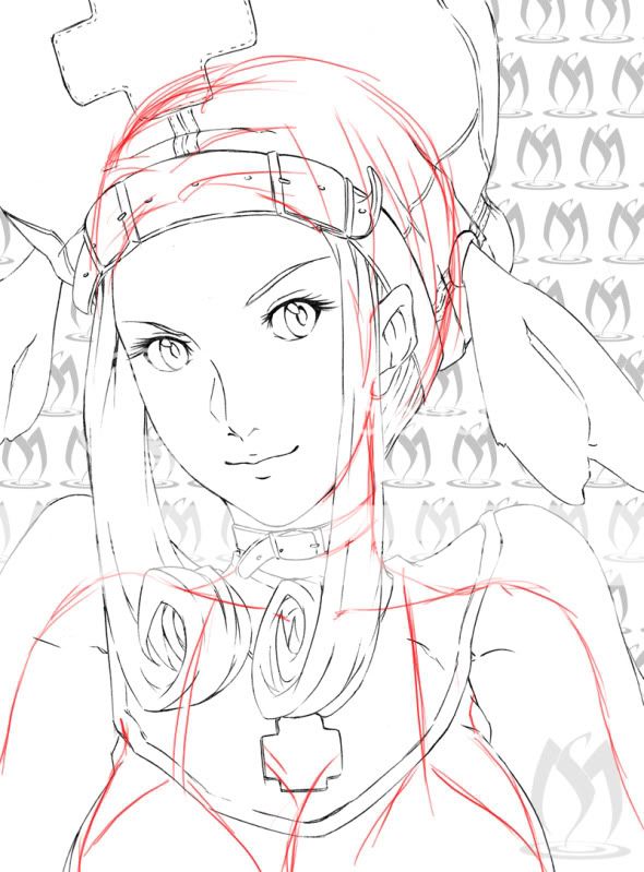
Here you can check the redlines (based on the original drawing) and I still think the neck holds the head just fine ._.

|
 |
 |
|
|
|
|
|
|
|
|
|
|
|
|
|
|
|
 Posted: Sun Sep 19, 2010 9:18 pm Posted: Sun Sep 19, 2010 9:18 pm
Honestly, that's worse. The head is almost as big and wide as the shoulders. It's just too big to be plausible. Heads need to be about half the width of the shoulders.
I'm being rough on you because I want you to get better. I know you can be a better artist. You've improved a lot since you first posted in this guild and I don't want you to get comfortable with where you are right now. You get a lot of dazzling comments, but you don't get as much critique.
|
 |
 |
|
|
|
|
|
|
|
|
|
|
|
|
 Posted: Sun Sep 19, 2010 9:33 pm Posted: Sun Sep 19, 2010 9:33 pm
Death T-2 Honestly, that's worse. The head is almost as big and wide as the shoulders. It's just too big to be plausible. Heads need to be about half the width of the shoulders. I'm being rough on you because I want you to get better. I know you can be a better artist. You've improved a lot since you first posted in this guild and I don't want you to get comfortable with where you are right now. You get a lot of dazzling comments, but you don't get as much critique. Actually where I want to get I don't think it's even related to anime sweatdrop
But I honestly didn't think it was THAT bad, but I guess it really is lol
|
 |
 |
|
|
|
|
|
|
|
|
|
|
|
|
|
|
|
 Posted: Sun Sep 19, 2010 9:41 pm Posted: Sun Sep 19, 2010 9:41 pm
IMO I really don't see a problem with anything ('cept the boobs). Everything looks relatively proportional to me. :I (Also, I just noticed the ear is angular, shouldn't it be round?) [.Potemkin.] Death T-2 That's one skinny neck. Shoulders can't curve upward like that, and the head should be smaller to fit the ribcage proportions. Your line quality is is good and the face is pretty nice, actually. Just be sure you aren't trying to fit other body parts to the page. I really appreciate your critiques, but I think you're just mistaken about a few things.
1-Her neck, in my humble opinion, isn't skinny at all, because if I just drew it a tiny bit thicker she would have ended looking like a man. The other line of the neck is obviously covered by her hair.
2-You're right, shoulders shouldn't curve like that, that's why those aren't her shoulders, it's just how the upper part of the dress is like.
3-I thought the head size was enough, because if you see where her humongous boobs are, you would realize how big her body actually is.
The head looks bigger with the hat she's wearing.
...and probably it wasn't your intention, but that one last line kind of offended me ._.
Then again, I might be wrong about all the points I just defended and in order for me to see where the flaws are (except her giant boobs) I would like someone to either confirm what you said or confirm what I said.
|
 |
 |
|
|
|
|
|
|
|
|
|
|
|
|
 Posted: Sun Sep 19, 2010 11:44 pm Posted: Sun Sep 19, 2010 11:44 pm
xena91388 IMO I really don't see a problem with anything ('cept the boobs). Everything looks relatively proportional to me. :I (Also, I just noticed the ear is angular, shouldn't it be round?) Round is boring ninja
|
 |
 |
|
|
|
|
|
|
|
|
|
|
|
|
|
|
|
 Posted: Mon Sep 20, 2010 12:17 am Posted: Mon Sep 20, 2010 12:17 am
 Redlined it for you. Simple skeleton in red, rest of it in blue. In relation to the torso, the shoulders are way too long. However, in relation to the head, the head is too large. As stated earlier, there are a lot of proportional problems here. If you are choosing aesthetics over realistic proportions, then you need to address the rest of the body as well. If she has a thin, slender neck, her arms and torso need to match accordingly, while still taking in account of the size of the head. Death T-2 is correct; the head starts becoming too humongous if the neck doesn't look like it can support. In addition, breasts are NOT a proper way to figure out proportions. Work with the ribcage first, not the breasts. You can tack on watermelons later. You have great design elements here, however, they aren't properly fitted over this character. Think in 3D. The head is a three-dimensional shape. Think of her neck as a cylinder, her torso as an upside down egg, etc. Draw AROUND each shape as if it were made of glass, and then start fitting in the details later. The belt on her head makes her feel like her skull is flat and rectangular at the end. I'm being harsh on you, I know, but mainly because I feel that your art's improvement has stagnated as of late. Any sort of critique is trying to help you, don't take it as an insult on your skill.
|
 |
 |
|
|
|
|
|
|
|
|
|
|
|
|
 Posted: Mon Sep 20, 2010 6:57 pm Posted: Mon Sep 20, 2010 6:57 pm
Kupocake  Redlined it for you. Simple skeleton in red, rest of it in blue. In relation to the torso, the shoulders are way too long. However, in relation to the head, the head is too large. As stated earlier, there are a lot of proportional problems here. If you are choosing aesthetics over realistic proportions, then you need to address the rest of the body as well. If she has a thin, slender neck, her arms and torso need to match accordingly, while still taking in account of the size of the head. Death T-2 is correct; the head starts becoming too humongous if the neck doesn't look like it can support. In addition, breasts are NOT a proper way to figure out proportions. Work with the ribcage first, not the breasts. You can tack on watermelons later. You have great design elements here, however, they aren't properly fitted over this character. Think in 3D. The head is a three-dimensional shape. Think of her neck as a cylinder, her torso as an upside down egg, etc. Draw AROUND each shape as if it were made of glass, and then start fitting in the details later. The belt on her head makes her feel like her skull is flat and rectangular at the end. I'm being harsh on you, I know, but mainly because I feel that your art's improvement has stagnated as of late. Any sort of critique is trying to help you, don't take it as an insult on your skill.
I wouldn't get mad because you point out my flaws lol
When I first got here it was way worse than this sweatdrop
I see you noticed where I'm pointing my finger at. Like I stated before, I feel like I'm somehow stuck and haven't been improving at all lately, and I don't know the cause...
It might seem like a cheap excuse, but that drawing is nearly 1 month old (just bought a new scanner since mine broke) and it's completely different for me to keep an eye on proportions when dealing with paper sizes of 8 1/2x11 inches, but like I said, it might seem and it's a cheap excuse.
I'm gonna start going more for realism now, but once I finish a few projects I have to finish.
Thanks! surprised
|
 |
 |
|
|
|
|
|
|
|
|
|
|
|
|
|
|
|
 Posted: Mon Sep 20, 2010 7:25 pm Posted: Mon Sep 20, 2010 7:25 pm
Glad to see you're taking it all well. C:
If I may make a suggestion, get a bigger drawing pad. Even a 9x12" sketchbook makes a world of difference. I personally would go for 11x14", big enough to see what's going on, small enough where it won't be a hassle. Remember, draw with your arm, not your wrist. You will draw looser, more intuitive lines that way, and drawing with your arm will preserve your wrist.
Carpal tunnel syndrome is a b***h.
|
 |
 |
|
|
|
|
|
|
|
|
 |
|
|
|
|
|
|
