|
|
|
|
|
|
|
|
|
|
|
|
|
|
|
|
|
|
 Posted: Tue Jan 17, 2012 11:30 pm Posted: Tue Jan 17, 2012 11:30 pm
 |
|
|
|
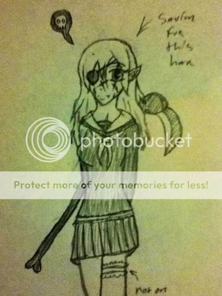
Well, it's looking fairly good. Your problem, as is the problem for everyone (including myself mrgreen ) is... ANATOMY! LeGASP!
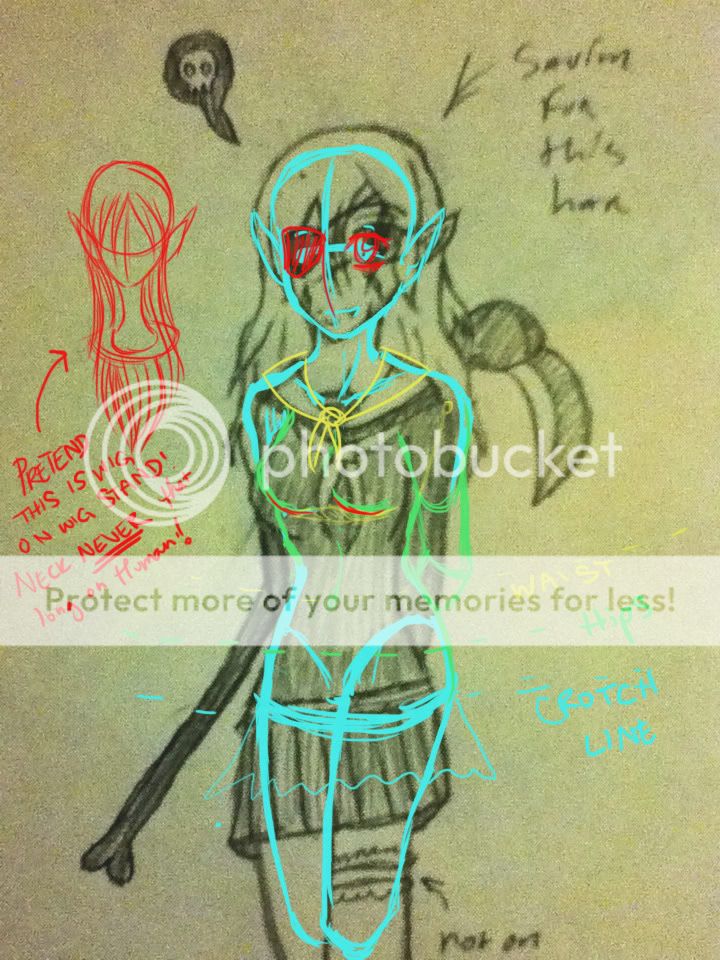
I like how you are not doing a body straight ahead; however, you need to compensate for that. For example, the girl looks like she's got a lopsided or disfigured set of *ahem* boobs. You need to show some indication, either with a shadow line or some shading. Beyond that, don't be afraid to give the girl some CURVES! Granted, I put way too many curves on my females, so you don't have to follow my guidelines directly, but you need more curves to at least indicate that the girl is turned. I didn't noticed the girl was turned for a while until I looked at the placement of the eyes in all honesty. I showed some guidelines for the waist (belly button), hips (where a skirt usually starts), and the crotch line (where your skirt starts). Again, you don't have to follow my proportions since mine are incredibly curvy, but just know that her skirt is kinda low down any way you slice it. Unless you meant it to be that way. Wasn't really sure. Looks good anyway, sort of like a Leg Avenue Harry Potter costume. Same sort of cut, only not quite as slutty. rofl
Other than that, I've noticed that you do the same thing my cousin does with his hair--you plan. Too much. Don't worry so much about it and try drawing with strokes. Trust me, it's much easier, and your hair will flow a little more naturally (once you get the hang of doing strokes). The red wig thing I drew is all strokes. 'Sides, stroking is fun (<--not meant to be dirty).
Oh! Before I forget (since my picture may be kinda hard to decipher), don't forget that because she's turned, her arm that is closest to us has to be IN FRONT of her side.
Okay, and in case you'd like to look at more anime/manga type anatomical guidelines, I've found some useful tutorials (which I am a big fan of; look at lots and lots of tutorials):
http://browse.deviantart.com/?qh=§ion=&global=1&q=manga+anatomy#/d1tc4t6
http://bittersweetdisease.deviantart.com/art/MANGA-to-REALISTIC-PART-ONE-215317699
(that one's not meant for you to draw realistically; I just put it up 'cause it gives great examples of various styles of manga heads. I do recommend going through the rest of the series--link in the comment--if you choose to transition to realistic. Actually, all of their tutorials are very well done).
http://browse.deviantart.com/?qh=§ion=&global=1&q=manga+tutorial#/d1jmx4z
http://browse.deviantart.com/?qh=§ion=&global=1&q=anime+body+tutorial#/d1i8c9m
Okay, this post is probably going to take up like the whole page (sorry sweatdrop ). So I'll end it here.
Keep in mind, my sketch-over was very quick, so it's very... sketch-y. Anyway, keep up with the good work. I'm not on often, so if you post something else, don't worry. I won't SPAM you with a ridiculously long comment every time (they don't really get shorter no matter what I do rofl ). Welcome to the How to Draw Manga Guild. 3nodding
|
 |
|
|
|
|
 |
|
|
|
|
|
|
|
|
|
|
|
|
|
|
|
|
Posted: Wed Jan 18, 2012 4:28 am
|
|
|
 |
Tarff Well, it's looking fairly good. Your problem, as is the problem for everyone (including myself mrgreen ) is... ANATOMY! LeGASP!
I like how you are not doing a body straight ahead; however, you need to compensate for that. For example, the girl looks like she's got a lopsided or disfigured set of *ahem* boobs. You need to show some indication, either with a shadow line or some shading. Beyond that, don't be afraid to give the girl some CURVES! Granted, I put way too many curves on my females, so you don't have to follow my guidelines directly, but you need more curves to at least indicate that the girl is turned. I didn't noticed the girl was turned for a while until I looked at the placement of the eyes in all honesty. I showed some guidelines for the waist (belly button), hips (where a skirt usually starts), and the crotch line (where your skirt starts). Again, you don't have to follow my proportions since mine are incredibly curvy, but just know that her skirt is kinda low down any way you slice it. Unless you meant it to be that way. Wasn't really sure. Looks good anyway, sort of like a Leg Avenue Harry Potter costume. Same sort of cut, only not quite as slutty. rofl
Other than that, I've noticed that you do the same thing my cousin does with his hair--you plan. Too much. Don't worry so much about it and try drawing with strokes. Trust me, it's much easier, and your hair will flow a little more naturally (once you get the hang of doing strokes). The red wig thing I drew is all strokes. 'Sides, stroking is fun (<--not meant to be dirty).
Oh! Before I forget (since my picture may be kinda hard to decipher), don't forget that because she's turned, her arm that is closest to us has to be IN FRONT of her side.
Okay, and in case you'd like to look at more anime/manga type anatomical guidelines, I've found some useful tutorials (which I am a big fan of; look at lots and lots of tutorials):
http://browse.deviantart.com/?qh=§ion=&global=1&q=manga+anatomy#/d1tc4t6
http://bittersweetdisease.deviantart.com/art/MANGA-to-REALISTIC-PART-ONE-215317699
(that one's not meant for you to draw realistically; I just put it up 'cause it gives great examples of various styles of manga heads. I do recommend going through the rest of the series--link in the comment--if you choose to transition to realistic. Actually, all of their tutorials are very well done).
http://browse.deviantart.com/?qh=§ion=&global=1&q=manga+tutorial#/d1jmx4z
http://browse.deviantart.com/?qh=§ion=&global=1&q=anime+body+tutorial#/d1i8c9m
Okay, this post is probably going to take up like the whole page (sorry sweatdrop ). So I'll end it here.
Keep in mind, my sketch-over was very quick, so it's very... sketch-y. Anyway, keep up with the good work. I'm not on often, so if you post something else, don't worry. I won't SPAM you with a ridiculously long comment every time (they don't really get shorter no matter what I do rofl ). Welcome to the How to Draw Manga Guild. 3nodding
Thanks, its okay, I always appreciate good criticism. Anatomy has always been a bit of a weaknes, so I thought the outline was really great. But if you really wanna see something messed up, wait till I post something with the arms not behind his/her back. xp Arms are evil, I never could get them right, length and thickness wise.
And, oh my golly gosh, don't get me started on hands. |
|
|
|
|
|
|
|
|
|
|
|
|
|
|
|
|
|
|
|
|
Posted: Wed Jan 18, 2012 5:31 am
|
|
|
|
|
|
|
|
|
|
|
|
|
Posted: Wed Jan 18, 2012 10:53 pm
|
|
|
|
AkaneShinigami Thanks, its okay, I always appreciate good criticism. Anatomy has always been a bit of a weaknes, so I thought the outline was really great. But if you really wanna see something messed up, wait till I post something with the arms not behind his/her back. xp Arms are evil, I never could get them right, length and thickness wise. And, oh my golly gosh, don't get me started on hands.
Good, you weren't upset. When I get really excited about helping, I sorta overdo it, and I don't want people to think they're no good just 'cause I got a little enthusiastic. Anyway, hope this helps loads. Oh! And I find that drawing hands in pieces works best. When I was critiquing another person's thing recently, I found this hand tutorial that I thought was pretty good.
http://johnyume.deviantart.com/art/Hands-Tutorial-215688245?q=boost:popular hands tutorial&qo=0
You should check it out (if you have time after all the other tutorials I threw at you rofl ). Hope I'm still on (not very good at keeping up with it when I go back to school). Have fun! mrgreen |
|
|
|
|
|
|
|
|
|
|
|
|
|
|
|
|
|
|
|
|
Posted: Thu Jan 19, 2012 1:07 pm
|
|
|
|
razz You took the wind out of my sails... I was going to say "Somebody doesn't like hands".... T__T Then in a later post you mentioned it.
T___T Ruined my fun.
I like the overall pic, but face seems kind of cluttered.
Also, this looks like the character is drawn quite small on the paper (due to the size of the text you wrote, based on most peoples handwritten size... My text is huge, but that's because I have horrible handwritting, and it's for others to read, I make it big. Also, the lines are quite thick, also leading to the small size thought)
Try taking up the whole piece of paper if you don't. This allows for getting better details in without it feeling as cluttered (talking about the face), and can also allow for extreme hyper details as well, if you want to go that route.
Only super major suggestion I can give that hasn't been said is to add in some folds to the cloth and such to add depth. Also, being it's a pleated skirt, you may want to not draw all the lines exactly across. Takes away from the feeling it's pleated like that. O-o or are those just fold lines?.... O-o.......
Anyway, Keep it up, you've got a lot of potential.
|
|
|
|
|
|
|
|
|
|
|
|
|
|
|
|
|
|
|
|
|
|
|
Posted: Wed Jan 25, 2012 8:52 pm
|
|
|
|
Caliber Mengsk razz You took the wind out of my sails... I was going to say "Somebody doesn't like hands".... T__T Then in a later post you mentioned it. T___T Ruined my fun. I like the overall pic, but face seems kind of cluttered. Also, this looks like the character is drawn quite small on the paper (due to the size of the text you wrote, based on most peoples handwritten size... My text is huge, but that's because I have horrible handwritting, and it's for others to read, I make it big. Also, the lines are quite thick, also leading to the small size thought) Try taking up the whole piece of paper if you don't. This allows for getting better details in without it feeling as cluttered (talking about the face), and can also allow for extreme hyper details as well, if you want to go that route. Only super major suggestion I can give that hasn't been said is to add in some folds to the cloth and such to add depth. Also, being it's a pleated skirt, you may want to not draw all the lines exactly across. Takes away from the feeling it's pleated like that. O-o or are those just fold lines?.... O-o....... Anyway, Keep it up, you've got a lot of potential.
Thank you for your critique. I've never been that good with clothing lines and the like. Also, what do you mean by depth? I don't quite understand what you meant there? |
|
|
|
|
|
|
|
|
|
|
|
|
|
|
|
|
|
|
|
|
Posted: Thu Jan 26, 2012 8:58 am
|
|
|
|
|
|
|
|
|
|
|
|
|
Posted: Sun Jan 29, 2012 10:04 pm
|
|
|
|
|
|
|
|
|
|
|
|
|