

BeautifullyDepressed
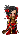
Theme: Evil
BethDEATH says:
Quote:
I love the way you paired the dress with the little shirts and gloves and things, I really love this whole "historically evil" type thing, and I'm surprised you were the only person to enter one like that in. My only complaints are the background, which is very cluttered, and the hat, which is adorable, but doesn't match.
Theme - 9/10
Matching - 8/10
Originality - 8/10
Over-All Appearance - 9/10
Creativity - 10/10
Total - 43/50
Imissy105 says:
Quote:
This is so adorable. I love the elegant evil look. Though, it doesn't look very evil, maybe a scythehidden behind the back would have completed the look? The hat is also a blueish black, so it doesn't match well.
Theme - 8/10
Matching - 9/10
Originality - 10/10
Over-all Appearance - 9/10
Creativity - 9/10
45/50
88/100

BeautifullyDepressed
Theme: Apollo
BethDEATH says:
I like how you did white and gold, bright sunshiney colors, becase he IS the God of the sun. Also, I'm only guessing the musical notes represent dance, or something alse he God'd over.
47/50
Imissy105 says:
Quote:
I would have liked some different items. There are a lot of repeats, like warmth of apollo, bow and arrow, ect. It kinda shows a lack of creativity. I like the colors, and matching though ^.^
46/50
93/100

BeautifullyDepressed
Theme:Australia
BethDEATH says:
Quote:
I loved this one, also. My only complaint is, you went crazy with the red...
45/50
Imissy105 says:
Quote:
i love it exclaim it look authentic and attracts the eye. The only thing a little iffy about it is the lack of over-all blue in the avi. Everything else is perfect.
48/50
93/100


BeautifullyDepressed
Theme:Colors
BethDEATH says:
Quote:
Avi #1 - This had too much white, but the little hints of yellow went great with countering that and bringing out the skin.
43/50
Avi #2 - You did use alot of Kottan Bell items, but everything but the hair was a different shade of grey.
36/50
Imissy105 says:
Quote:
First Avi: i feel like the skin is being hidden by the items, not highlighted. also, i think yellow and white are a little too close in color to contrast. I think black or blue would have been a better color.
30/50
Second Avi: once again, i feel like the inclusion of white changed the theme of the avi...it was supposed to be all one color. Also the use of multiple kottan bells seems a little lacking...
35/50
146/200
All the one's from above were from a contest that I won first place in ;D
Quote:
Avi #1 - This had too much white, but the little hints of yellow went great with countering that and bringing out the skin.
43/50
Avi #2 - You did use alot of Kottan Bell items, but everything but the hair was a different shade of grey.
36/50
Imissy105 says:
Quote:
First Avi: i feel like the skin is being hidden by the items, not highlighted. also, i think yellow and white are a little too close in color to contrast. I think black or blue would have been a better color.
30/50
Second Avi: once again, i feel like the inclusion of white changed the theme of the avi...it was supposed to be all one color. Also the use of multiple kottan bells seems a little lacking...
35/50
146/200
All the one's from above were from a contest that I won first place in ;D