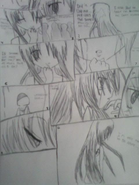
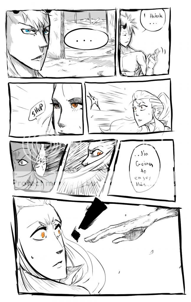
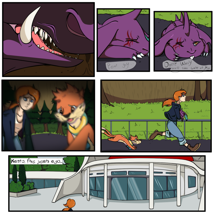
- Title: Uraha Page One
- Artist: ipnest
- Description: This is page one, yes i know i have nothing on the bottom left corner but its done now i'm just to lazy!
- Date: 04/02/2009
- Tags: uraha page
- Report Post
Comments (7 Comments)
- Nikkiela - 07/16/2011
- nice smile
- Report As Spam
- Darkly_Doomed - 03/11/2011
- As error404 said, the composition is really tough to understand and messy. You probably could take the one page you have here and make it into two pages. That could clear up the composition as well, and overall just help. What I can see isn't bad; it just needs some work for its full potential and awesomeness to come through.
- Report As Spam
- D_letion - 08/10/2010
-
waaaaay too blurry.
also, work on the composition of the boxes. they're so messy. If you can't tell which one goes next (have to put numbers on it) then it's wrong. comics should be short and simple in the way of box readability. - Report As Spam
- Light Angel06 - 04/05/2010
-
Just like they said
i can't read it >.<
4/5 - Report As Spam
- -Gosu_Chaos- - 12/29/2009
-
Panel 11 looks awesome along with panel 12
5/5 smile
- Report As Spam
- Okamiku - 08/05/2009
-
luff da haIR
- Report As Spam
- Dreya09 - 05/08/2009
- Cool! I love how you draw profiles, and this pic would surely be better if it wasn't as blurred! Nice job, anyways! wink
- Report As Spam


