- by Splinter-kun |
- Painting And Drawing
- | Submitted on 10/14/2003 |
- Skip


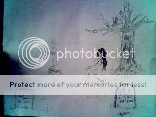
- Title: another page of a comic
- Artist: Splinter-kun
- Description: another quick comic page, testing out combat scenes and other lettering effects. Whatcha think?
- Date: 10/14/2003
- Tags: onlinecomics
- Report Post
Comments (7 Comments)

- factually118493 - 01/01/2008
- Oh!... much awesome art. 10/10
- Report As Spam

- sieg777 - 12/17/2007
-
personally, this one prefers more dynamic
lettering. the sounds should have a dynamic look.
that would make the actions really stand out. - Report As Spam

- Tachimaru Heiro - 12/17/2007
- Nifty
- Report As Spam

- tai-mule - 12/03/2007
-
err... did u really draw this? razz
If u did,
congratulations! - Report As Spam

- ichitata - 12/03/2007
- nice job
- Report As Spam

- Reaper2372 - 12/03/2007
- ...
- Report As Spam

- Kozuo - 11/25/2007
-
you should really reall go to blambot.com and
download some nice, proper comic book fonts. cuz
your comics look great, but the fonts make it look
really amateurish. they'll look perfect once you
throw some pro fonts in there.
and most of
blambot's fonts are free. hope i didn't come off
too harsh, just want to help. :] - Report As Spam