- by lunar wolverine |
- Painting And Drawing
- | Submitted on 08/06/2009 |
- Skip
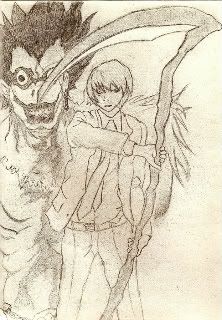
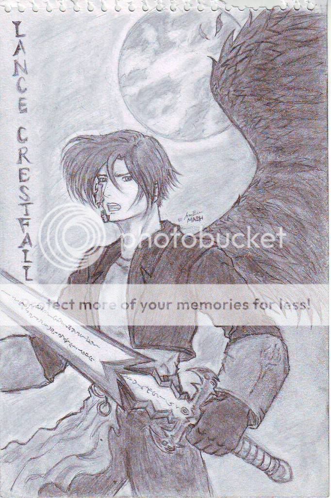
- Title: Death Note cover. # 1
- Artist: lunar wolverine
- Description: This is basically Light from the cover and Riuk that is shown a few pages in from the cover. It took a super long time to do...3 straight days to draw and another to shade. I want comments. Lots! Please Please!
- Date: 08/06/2009
- Tags: death note cover
- Report Post
Comments (6 Comments)
- MizMoosic900 - 08/07/2009
- im not much of a note fan, but i cant argue; this is pretty dang good. a helpful hint... make sure your arms are proportional and have elbows. discluding them causes the arms to look dislokated.
- Report As Spam
- Pho Vn - 08/07/2009
- very good. 5/5
- Report As Spam
- nocturne006 - 08/07/2009
- It is quite good but when you copy you should also try to draw their bodies and faces in proportion instead of just focusing on the lines. Try to experiment with shading, tones from 1 to 10 and try not to smudge too much. Overall I think its good.
- Report As Spam
- Comrade Captain Vostrikov - 08/06/2009
- Looks very good. I like it
- Report As Spam
- silver_mizu - 08/06/2009
- hmm...looks like a trace to me...
- Report As Spam
- xXUglyAlicexX - 08/06/2009
- Ryuk looks awesome but Lights face seems a bit, scrambled? Maybe if i could zoom in ...
- Report As Spam


